Building a design process
As our product grew and more people joined the team, navigating through our Figma files became a real pain point. It was slowing us down, confusing stakeholders, and making collaboration across platforms messy and inefficient. This case study covers how I rebuilt the design structure and workflow to solve this — making it scalable, easy to use, and intuitive for everyone involved.
Timeline
February 2023
Platform
Internal Process
Role
Senior Product Designer
TL;DR – Reorganizing Figma Files to Improve Team Efficiency
Context: The design team struggled with disorganized Figma files that combined multiple platforms, lacked structure, and slowed down collaboration.
Challenge: Designs were hard to find, file load times were long, and there was no clear indication of design status or platform relevance — causing confusion for designers, PMs, and developers.
Role: As a Senior Product Designer, I led the restructuring of all design files by introducing a scalable naming system, status-based page structure, and platform separation. I also documented a clear working process for the team.
Impact:
• Improved navigation and async collaboration across teams
• Faster file loading and reduced confusion between iOS/Android designs
• Less time wasted in meetings just to clarify design status
Why It Matters:
Good design operations make great product design possible. This process overhaul removed daily friction and made the team faster, clearer, and more autonomous.
Gathering the information
First, I asked about all team members' struggles with the current Figma organization structure. I've got some useful insights from the mobile developers and project managers such as:
Hard to find relevant design
It is not clear whether the design belongs to the supply or demand side
Files take a long time to load
Files are consuming a lot of memory
Android designs always messed up with iOS since they are in the same file
Designers don't understand where to start working on the new tasks or features
Difficult to understand which designs are ready for review
Goal
Redesign the Figma structure and design flow so that:
• Developers, PMs, and stakeholders can easily navigate files on their own.
• Designers have a clear system for starting and finishing tasks.
• Cross-platform confusion is eliminated.
• File performance is optimized.
• The process is scalable and repeatable.
Impact
Here’s what changed after rolling out the new structure:
• Navigation became intuitive — even for new teammates
• Loading times improved significantly, especially on older machines
• Designers spent less time in hand-holding meetings
• Devs stopped mixing up iOS and Android flows
• PMs could find relevant screens without pinging a designer
• Stakeholders were able to review work asynchronously
Our Users
Before diving into the process, I spent time understanding the needs of everyone who touches Figma — not just designers.
These were the key voices I focused on:
• Mobile developers: Needed clear separation of platforms.
• Project managers: Wanted visibility into what’s final vs WIP.
• Designers: Needed guidance on where to start new work.
• Stakeholders: Didn’t want to depend on someone to “walk them through the files.”
Their feedback became the foundation of the new system.
Process
Research & Feedback
I started with user interviews — short syncs with devs, PMs, and designers. Here’s what I heard:
•“Designs take forever to load.”
•“I can’t tell if this is for Android or iOS.”
•“Which designs are final?”
•“Where do I put new work?”
I synthesized the insights and sketched out a proposal to fix the core pain points.
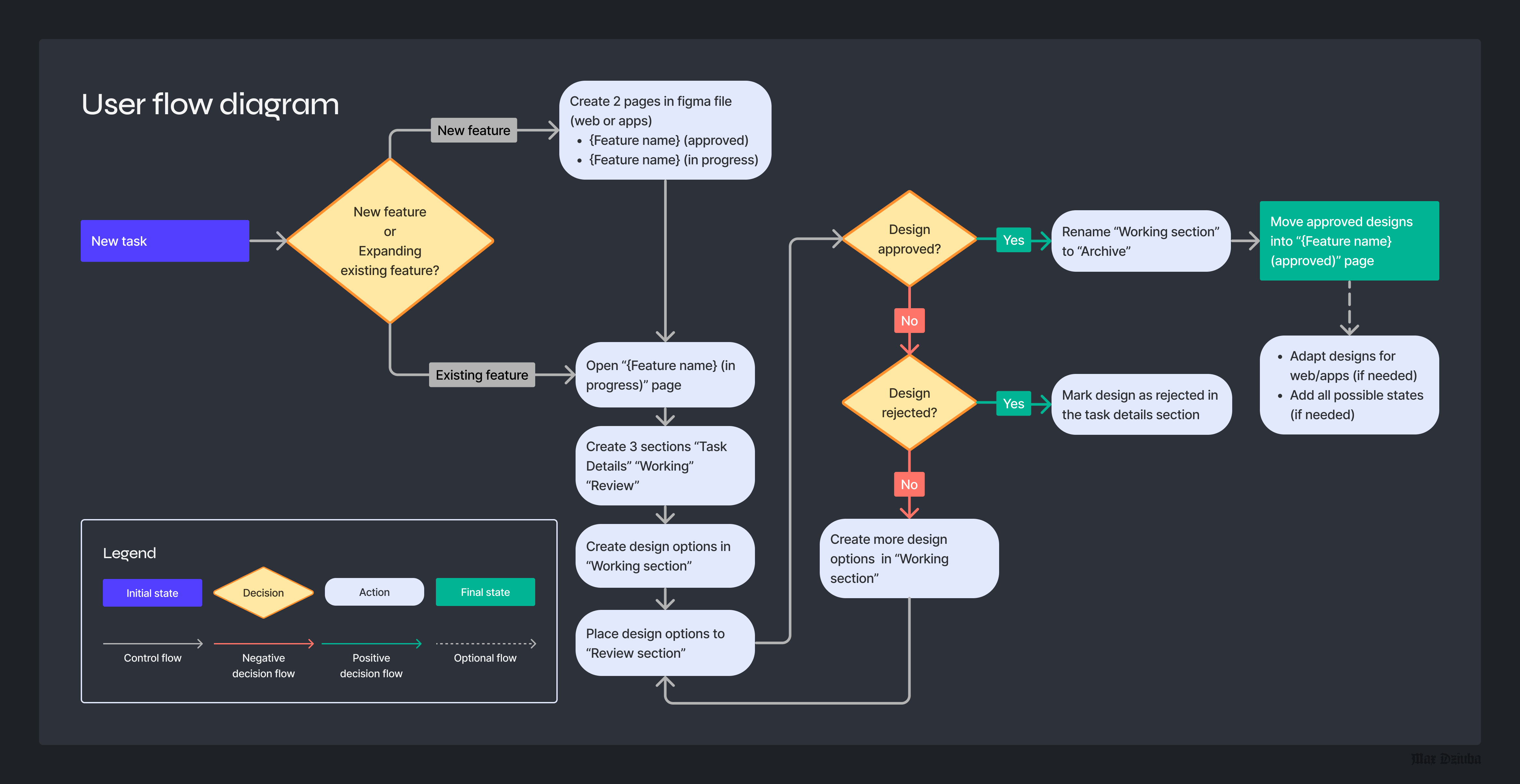
Designer's flow
Another crucial part of this task was to create a flow that would clearly explain to other designers how they should operate within the new Figma structure. The following diagram illustrates the design creation process for a new task from scratch to final deliverables. Every design team member should stick to this flow so the structure will be coherent.
Components
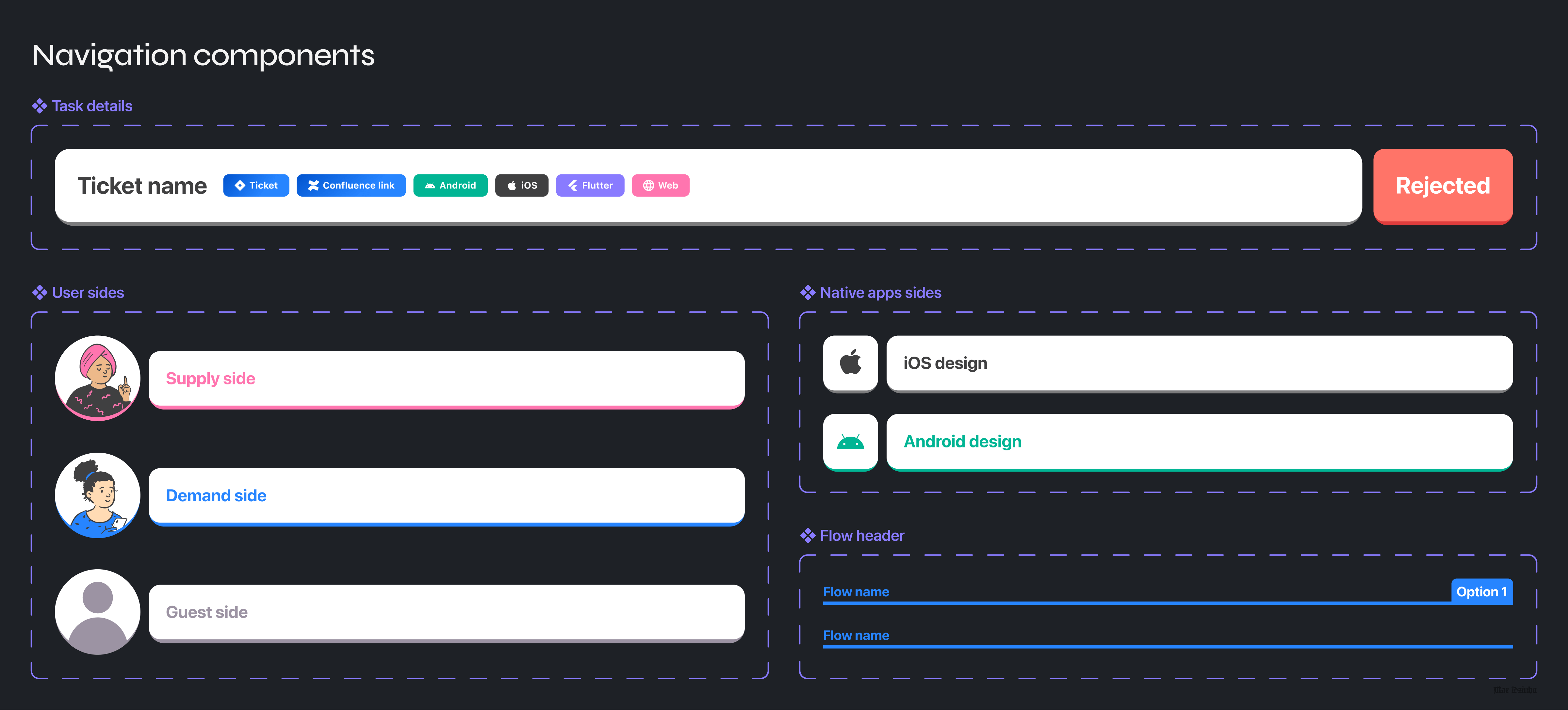
I created components to easily access information about tickets for PMs, developers, and designers. Also, I separated the product into user and platform sides according to the existing structure for easy design identification. Each component has a role, such as:
❖ Task details – helps the user to navigate across external links to jira tickets, confluence pages, the same design for different platforms, etc
❖ User sides – represent supply, demand and guest side of the design flow
❖ Native apps sides – useful when the design for both platforms is created in the same file
❖ Flow header – used to name different flows under the same side or platform
Developing new structure
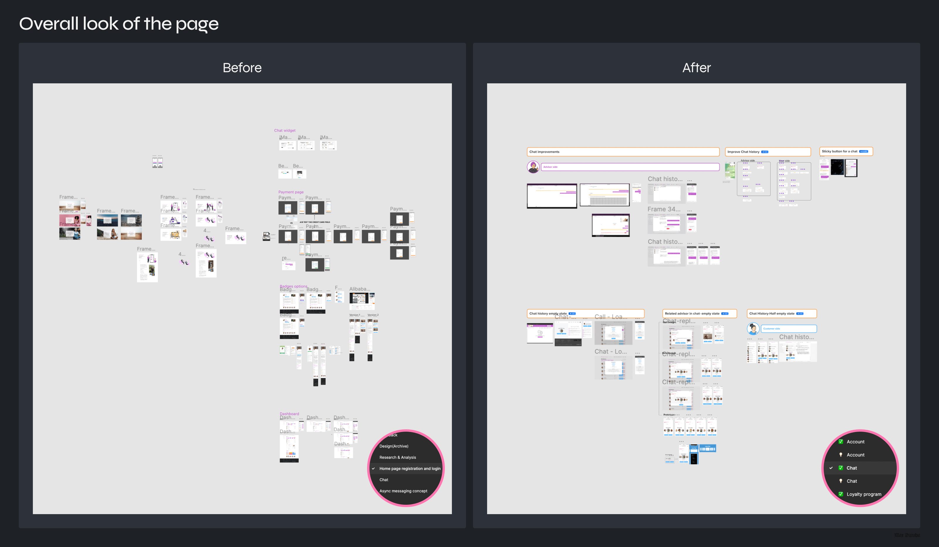
Based on the insights I've created a proposal for the new structure. Since the product's scale is medium, I kept the existing logic of storing designs on separate files. First of all, I moved Android designs to the new file. The next step was to simplify the understanding of design relevance.
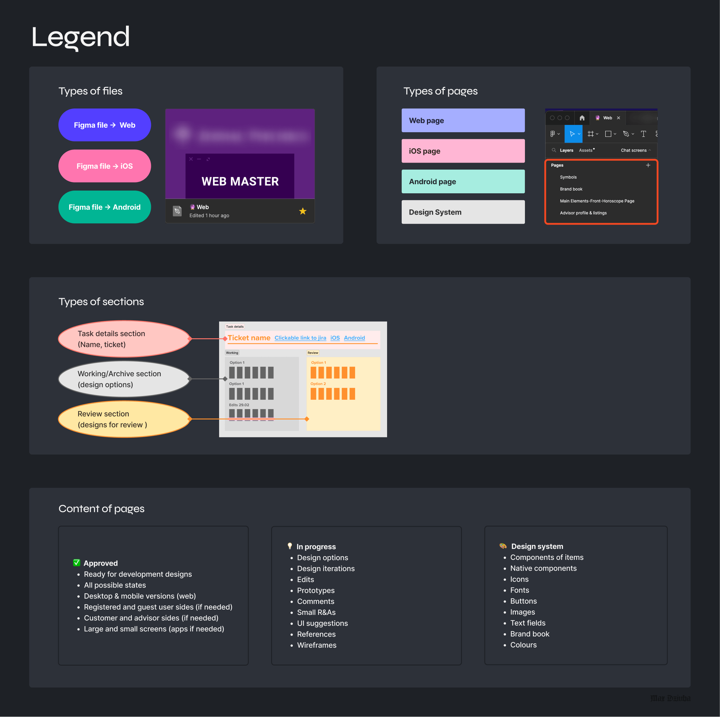
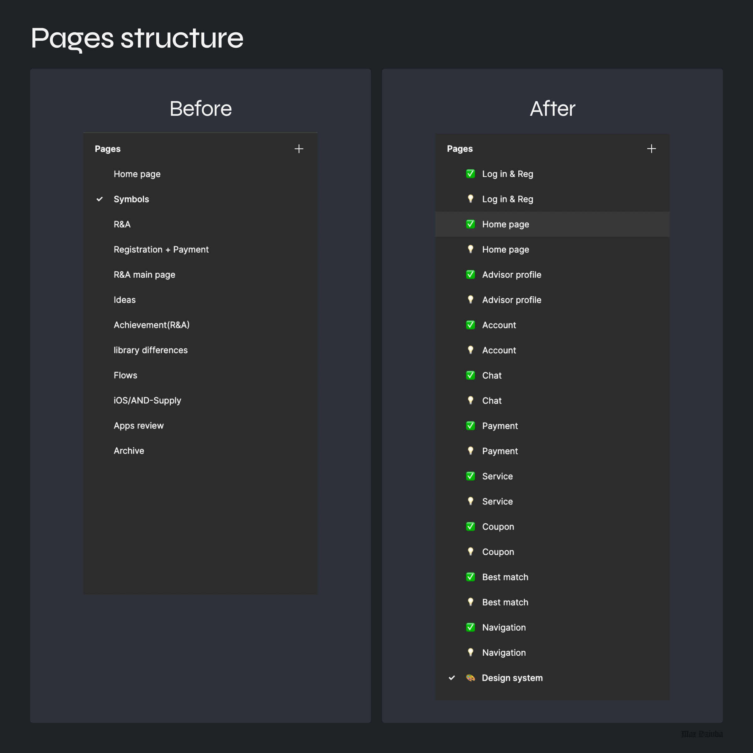
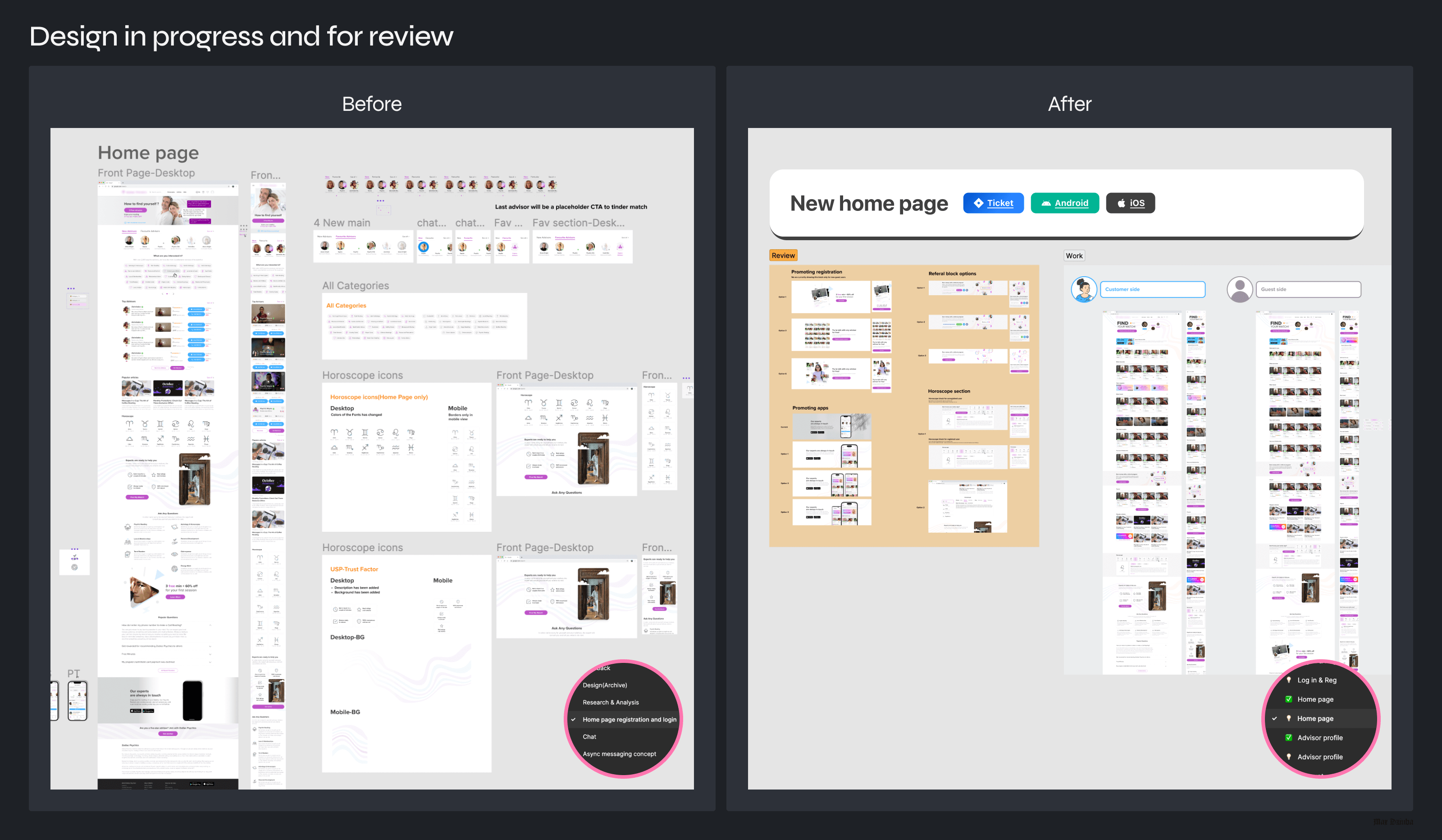
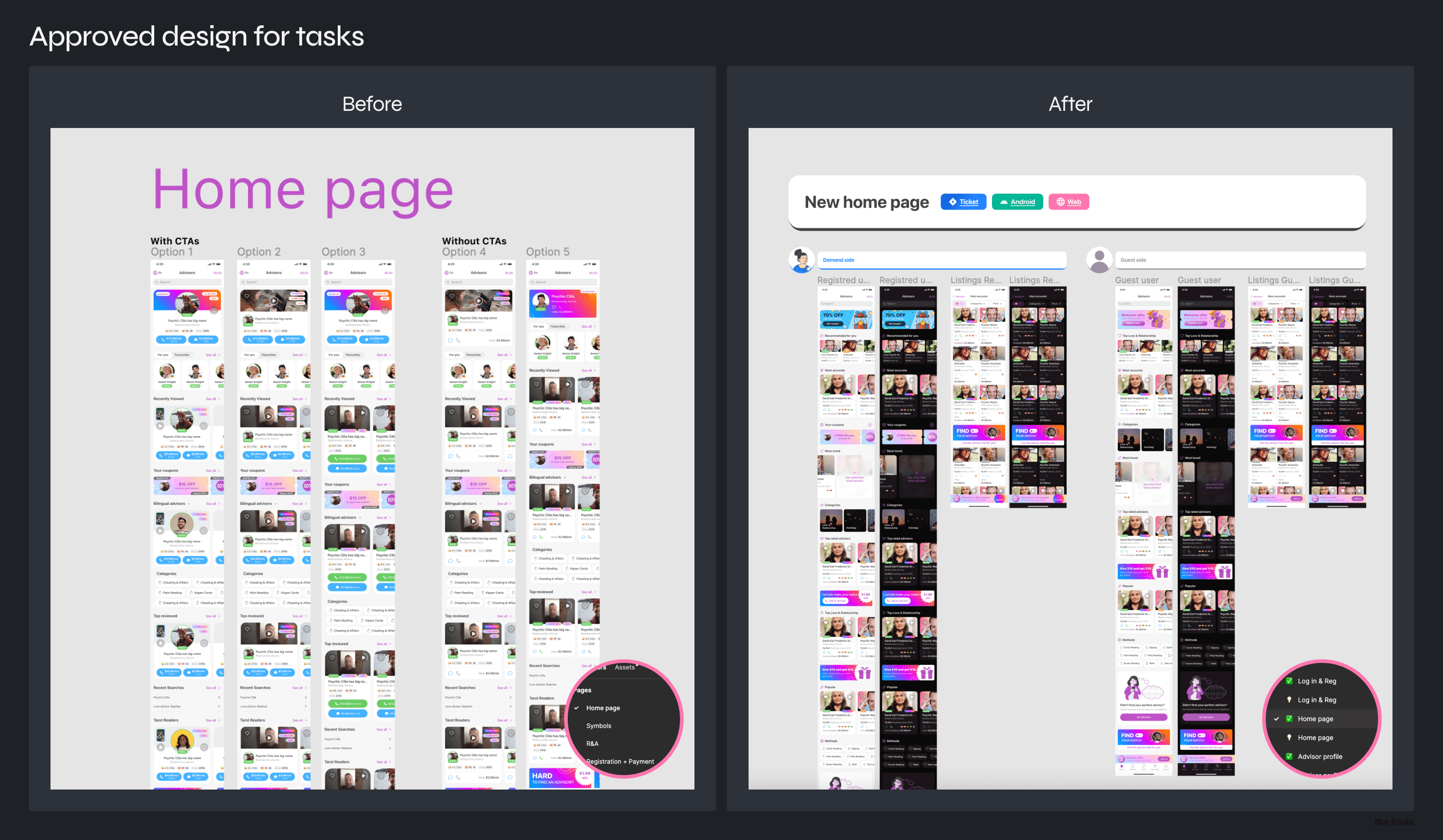
I analyzed existing designs and grouped them into 10 main features. Each feature has 2 own pages – "in progress" and "approved"'. Final designs should be placed on the "✅ {Feature Name} approved" page and all the work-in-progress files under "💡{Feature Name} in-progress". All three files will have the same order and structure, making navigating across different platforms easier.
Each "in-progress" file contains 3 sections. Task details with name of the task and links to Jira and Confluence; Working section with all the design screens; Review section – contain only ready screens that are ready for presentation.
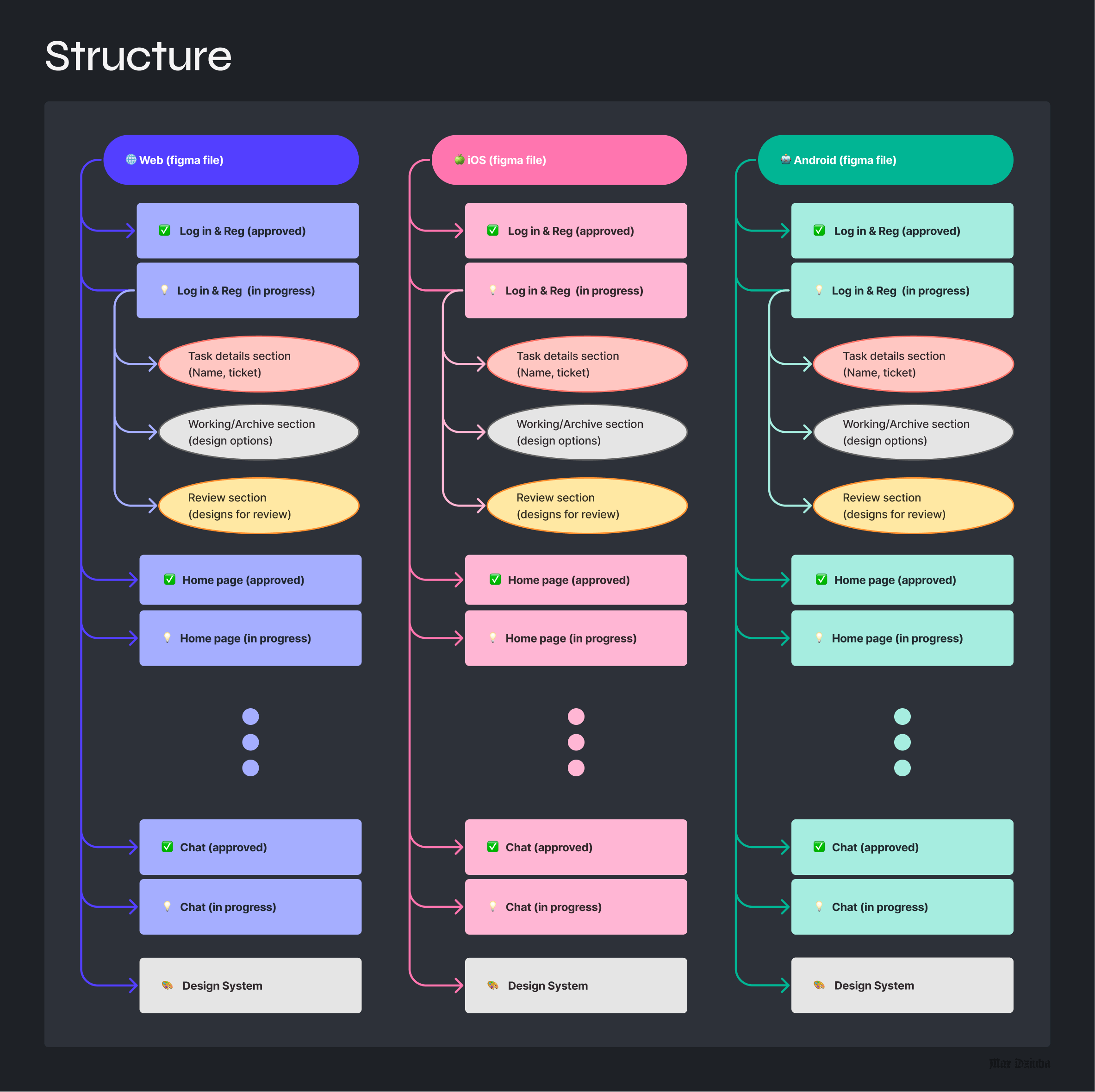
Final “Designs”
Here’s a peek into the result:
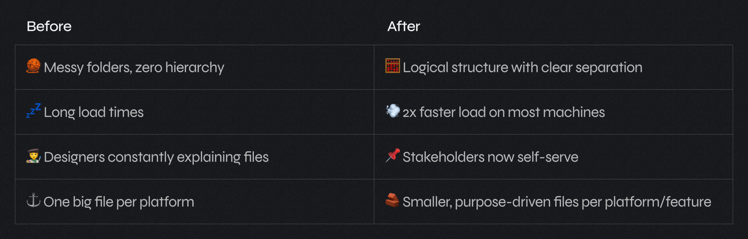
Before/After
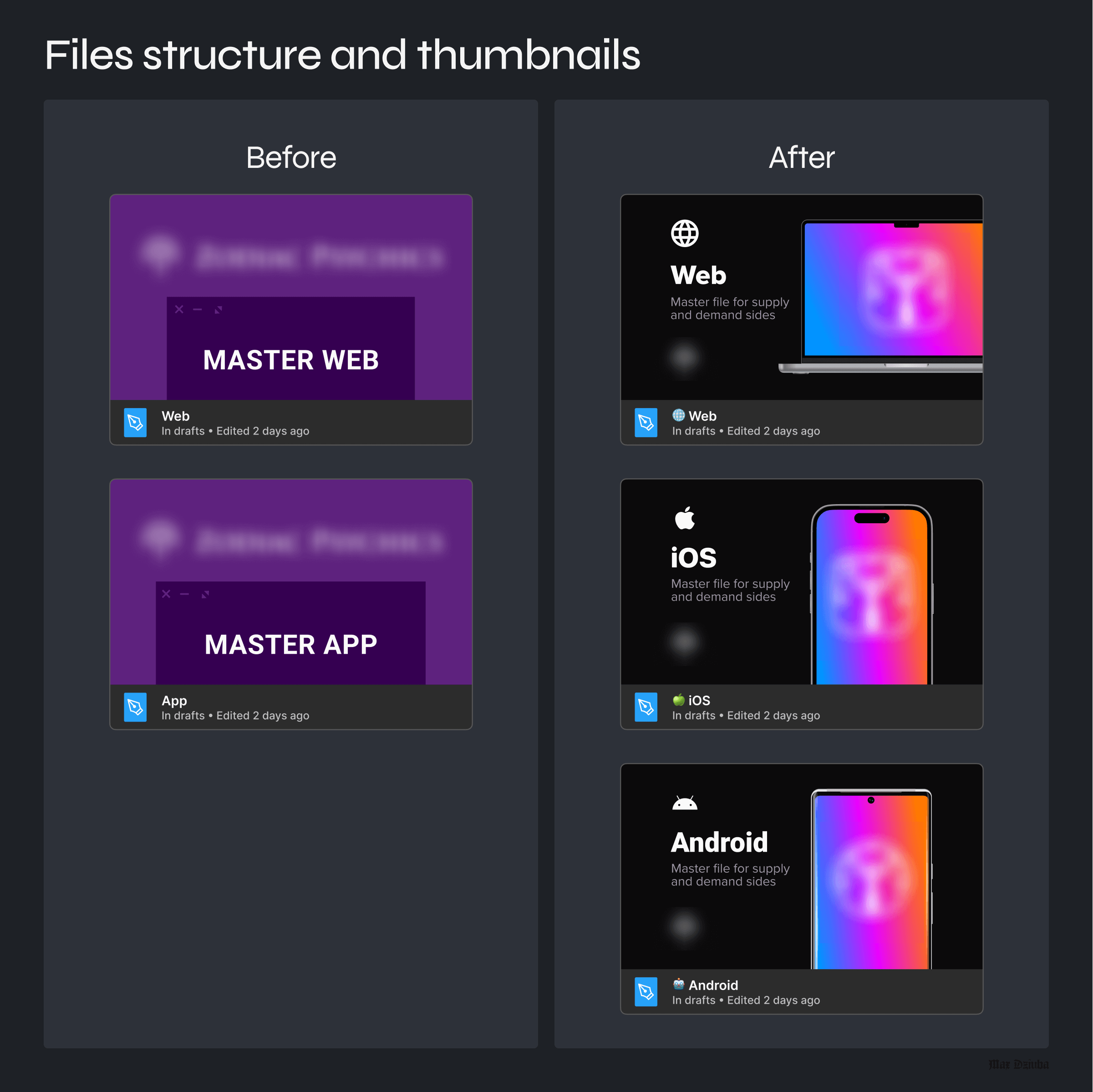
Once the structure was approved I moved all the existing designs that were already implemented or scheduled for sprints to approved pages (e.g. ✅ Home page) and sorted them by relevance. The remaining designs have been placed on the in-progress (e.g. 💡 Home page) pages. The transition went smoothly but the problem appeared with the Android designs because I moved them to the new file so all the links across the tickets were broken. It took a bit more time to relink them but the result was worth it. By dividing one app master file into 2 separate files I highly increased the loading speed. As a final touch, I redesigned file thumbnails to simplify preview recognition (e.g. on Slack or Jira). Below you can see a comparison of the Figma files structure.
Learnings
• Designing for your team is just as important as designing for users. A good system saves hours every week.
• Never underestimate clear naming and visual hierarchy — they’re UX tools, even in internal tools.
• Early feedback loops helped get buy-in and avoid resistance during rollout.
• Small touches like file thumbnails and reusable components made a bigger impact than expected.
Future
• I plan to evolve this system with versioning indicators and changelogs to keep everyone aligned during rapid iteration.
• Considering adding light onboarding in Figma for new team members.
• Would love to automate some parts of the workflow using plugins or Figma variables once they mature.
P.S.
After a few months, the new structure received positive feedback across the team. PMs and devs could navigate files faster, loading speeds improved (especially on older hardware), and stakeholders found it easier to review designs independently. Designers no longer needed to join meetings just to guide navigation — and devs finally stopped mixing up iOS and Android designs 😄
Thanks for reading! 🙌
If you have a chaotic Figma setup — don’t wait until it breaks.
Structure scales. And it’s a game-changer for collaboration.