Redesigning Supply Experience
for a Chat-Based Platform Serving 500K Users
Timeline
Aug 2023 — Sep 2024
Platform
Web
Role
Senior Product Designer
TL;DR – Advisor Tools Redesign (B2C Marketplace Platform)
Context: After being acquired by a U.S.-based market leader, adviqo Group — a global platform connecting spiritual advisors with clients — initiated a full backend and frontend overhaul of its 20-year-old advisor platform. The redesign aimed to improve the supply-side experience and streamline operations across multiple brands.
Challenge: A tight timeline driven by backend migration (from Questico to Zodiac) and legacy tech from 2003 meant that research, feature scope, and design had to be approached pragmatically. The existing advisor tools were fragmented, hard to scale, and required high manual support.
Role: As a Senior Product Designer, I partnered closely with the Lead Designer and Product Director to drive UX execution, build high-fidelity prototypes, and create a scalable Design System. I worked cross-functionally with developers to align backend constraints with user flow improvements and MVP delivery.
Impact:
• 30% drop in support workload by automating profile validation for advisors.
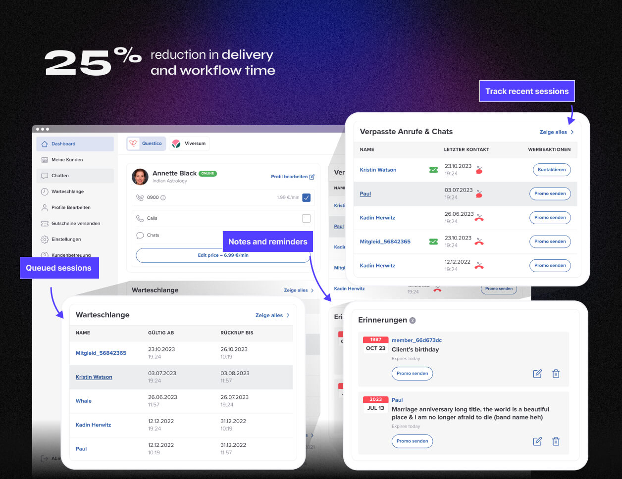
• 25% reduction in delivery time for core workflows by restructuring user flows and backend logic alignment.
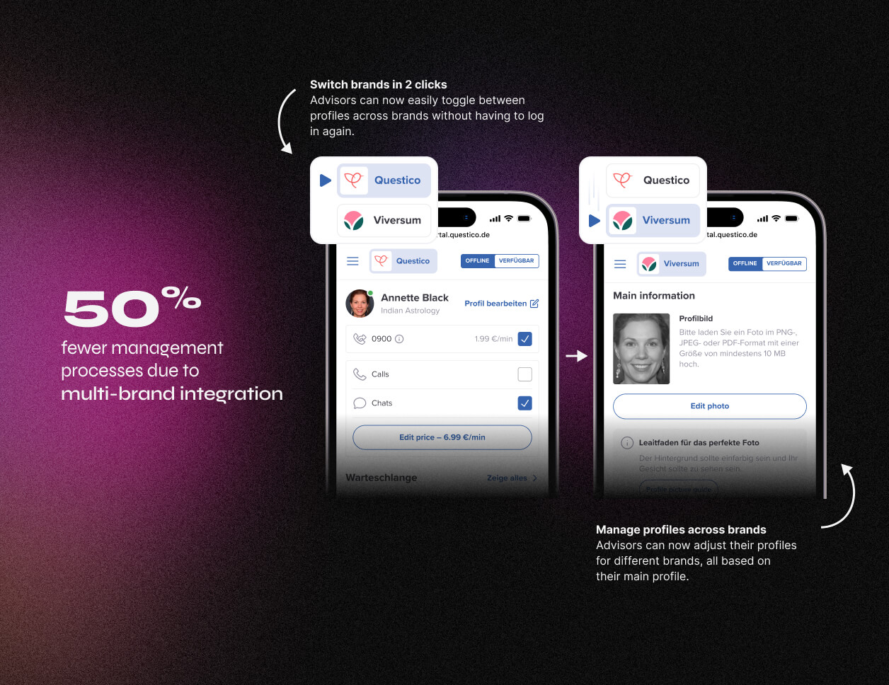
• 50% fewer manual management tasks due to multi-brand platform integration.
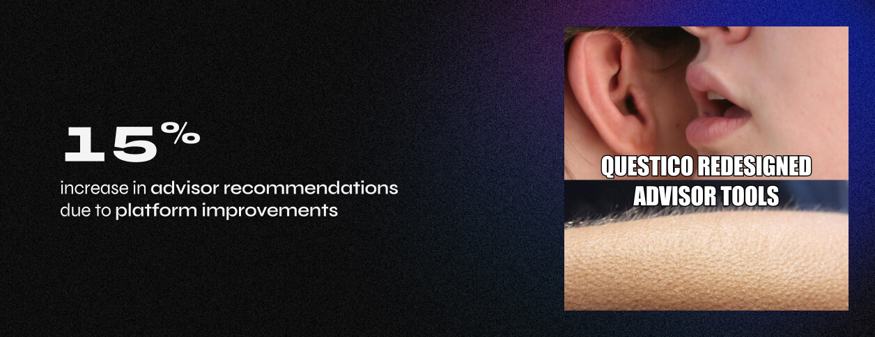
• 15% increase in advisor recommendations post-launch, reflecting improved UX and onboarding.
• Delivered MVP in phases, validating early assumptions and laying the foundation for future iterations.
Why It Matters:
This was a real-world example of designing under pressure, where legacy constraints, migration dependencies, and platform integration had to be balanced without losing UX quality. I proved I could deliver fast, collaborate across roles, and still drive meaningful impact even without deep research upfront.
Introduction
adviqo Group connects people seeking spiritual guidance with experienced advisors, offering a life-coaching GPS. After a company reorganization and a shift in focus, they set out to improve the advisor experience on the supply side. The goal? To make the spiritual advice marketplace more seamless and enjoyable. With 20+ years in the business, they ensure users across the US, Europe, and beyond receive a top-tier experience.
Adviqo GmbH has been acquired by Ingenio, US-based category leader on May 2022.
In this case study, we’ll dive into the redesign process aimed specifically at enhancing the advisor experience.
My Role
As Senior Product Designer, I collaborated closely with my Lead, Savvino, and Product Director, Jan, ensuring smooth problem-solving. Worked with Chapter Lead Front-End, Maksim, to align design with development while leading the creation of a Design System and high-fidelity Figma prototypes. Irena and Ala supported daily tasks, keeping the project on track.
Problem
The platform's tech, unchanged since 2003, faced major challenges: an inflexible backend and outdated HTML/CSS frontend blocking progress. With a full tech overhaul underway, it was the perfect chance to redesign the site and tackle key issues, which are detailed below.
PROBLEM #1
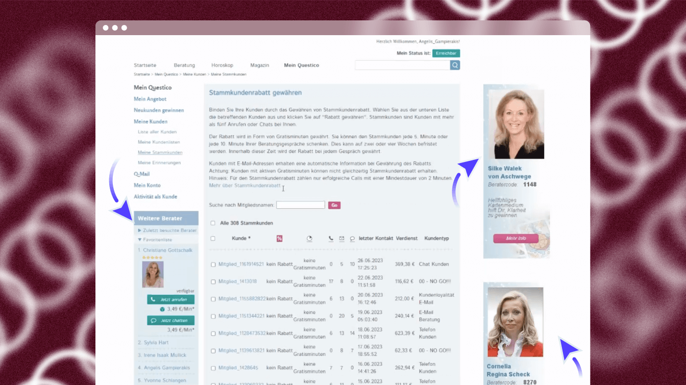
No Relevancy
Without a clear structure, the platform’s interface was a maze. Poor visual hierarchy mixed critical advisor workflows with customer-facing content, creating a chaotic experience. High-value features were buried under clutter, slowing workflows and testing patience.
Example
• No separation between advisor and customer content meant irrelevant information everywhere.
• Too much text and scattered design made focusing nearly impossible.
• High-priority tools were hidden, requiring advisors to hunt for them.
Impact
Advisors, unable to streamline their workflows, spent more time researching competitors instead of focusing on improving their processes and serving their customers effectively.
PROBLEM #2
No Clear User Journey
The platform lacked defined user flows, turning every interaction into guesswork. Navigation was messy, with multiple disconnected entry points. The interface presented a steep learning curve, overwhelming users with all options at once, without progressive disclosure to ease them in.
Example
• A cluttered interface with no clear task paths made even simple actions feel daunting.
• Users stumbled into flows unintentionally, creating confusion and inefficiency.
• Without onboarding guidance, new users faced a mountain of effort just to get started.
Impact
The steep learning curve and undefined journeys led to frustration and wasted time, leaving users struggling to complete tasks and diminishing overall productivity.
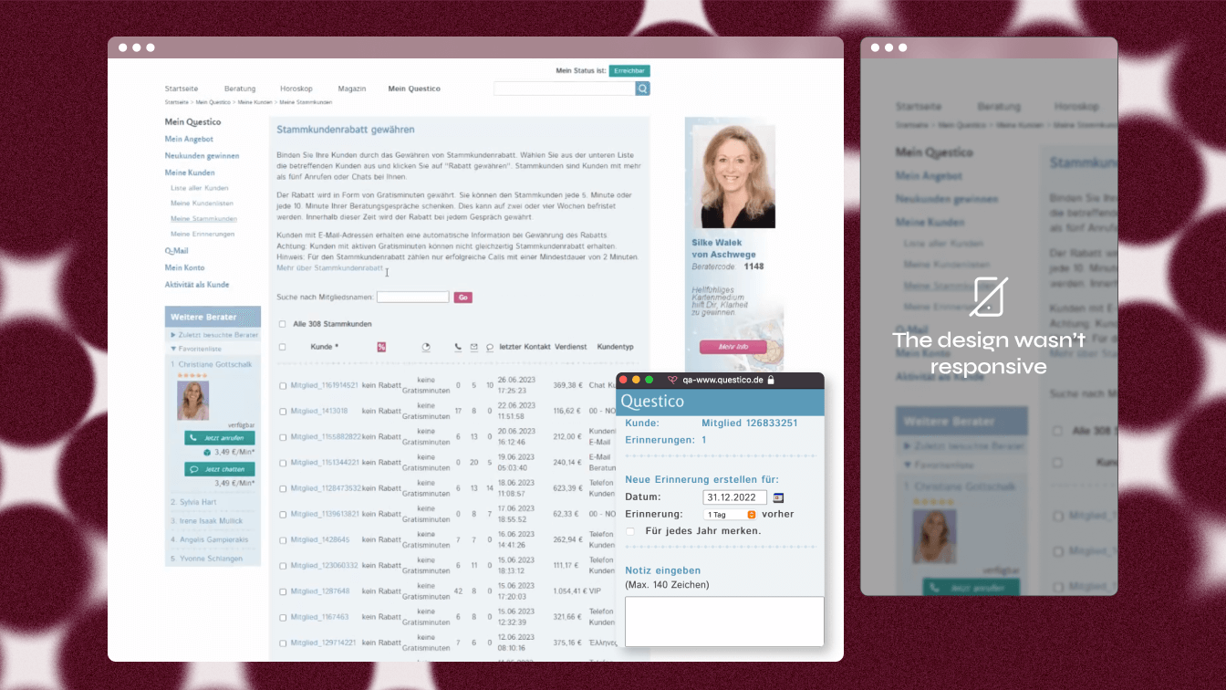
PROBLEM #3
Outdated Tech
The website’s design and performance were stuck in the ’90s, leading to major trust issues and a dated experience. Manual processes overwhelmed customer support, and there was zero mobile compatibility. The backend and frontend lacked flexibility, causing constant friction and internal inefficiencies. Inconsistent design components created a patchwork interface—when one broke, the entire site could crash.
Example
• Advisors had to manage billing and queues manually.
• Common tasks like profile edits or registrations required CS intervention.
• Maintaining two websites (Viv and QDE) meant duplicating effort for everything.
Impact
Without a unified, scalable design system and consistent UI, the platform remained fragile and inefficient, wasting time patching outdated solutions instead of delivering value.
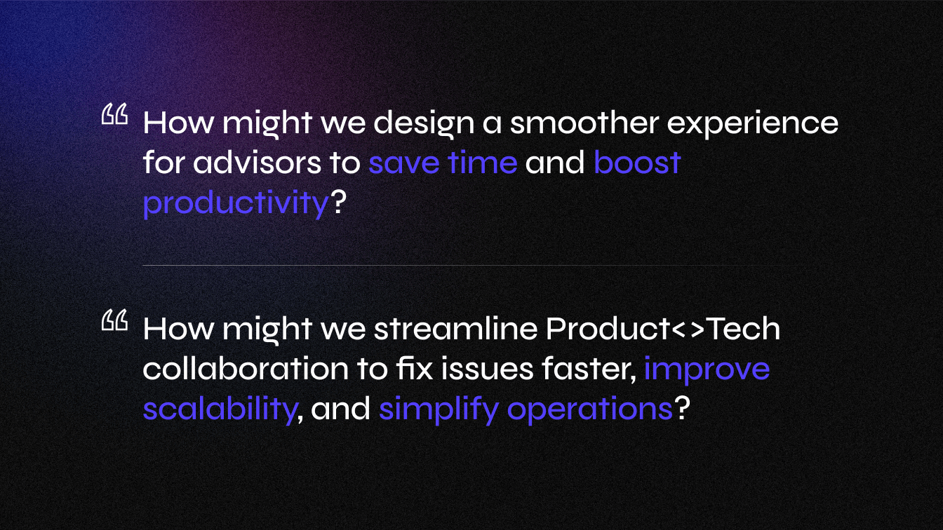
Defining the problem
Goals
BUSINESS GOALS
Increase Trust with Advisors (Supply-side users)
By shifting focus from customers to advisors, we aim to improve product quality — a key area we’ve overlooked for the past 20 years.
“The supply knows our customers better—let’s enable them to make the most of it.”
Operational Efficiency
To streamline internal operations, we’ll build scalable design components that work across our platform, ensuring consistency and efficiency.
Eliminate Manual Processes
By reducing bottlenecks caused by customer support interventions, we’ll speed up workflows and enhance overall efficiency.
USER GOALS
Increase Transparency & Awareness
• Lack of transparency has impacted trust with advisors. We aim to demonstrate the value we bring to foster better partnerships.
• Increased awareness can boost their focus and performance—ultimately benefiting their income.
Increase Productivity
• Improve advisors’ daily workflows, so they can spend less time on repetitive tasks and more time delivering valuable services to clients.
• We’ll provide performance tracking to help them monitor and enhance their productivity.
Impact
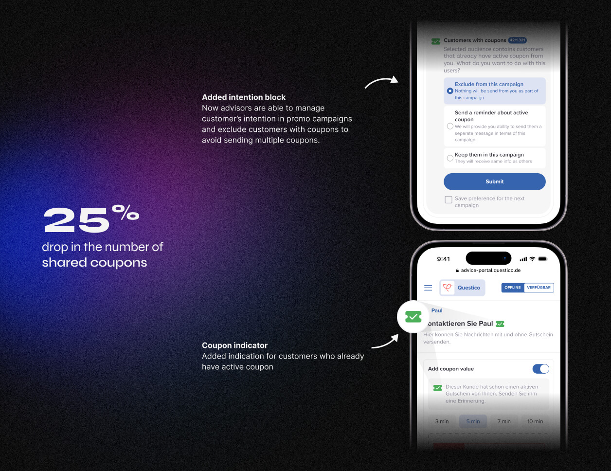
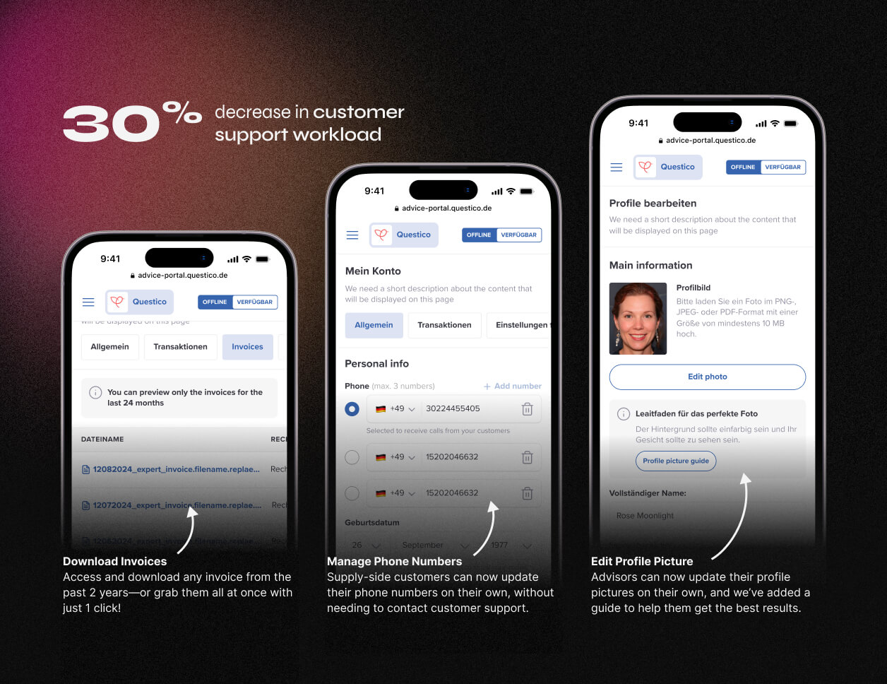
As this was a large-scale project, we rolled out the new designs in phases to quickly validate some of our hypotheses with the MVP.
For confidentiality reasons, I have omitted the specific values for these metrics.
Our Users
Before we began designing, we thoroughly explored behavioral patterns and preferences of our target audience. We also conducted user observations to gain deeper insights into their daily routines and needs.
Our focus was to understand the role our platform plays in connecting customers with genuine spiritual advisers.
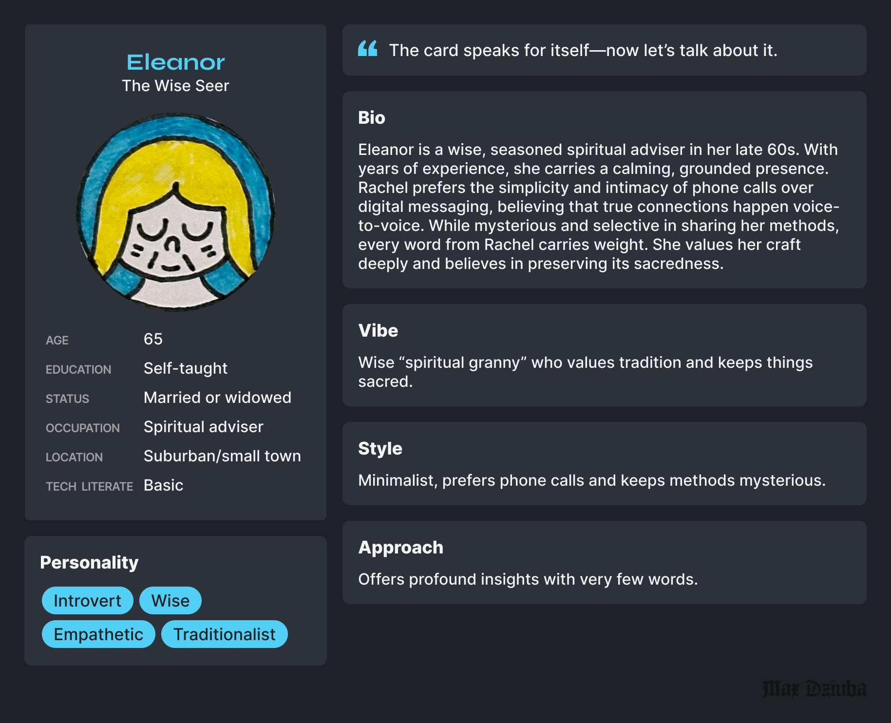
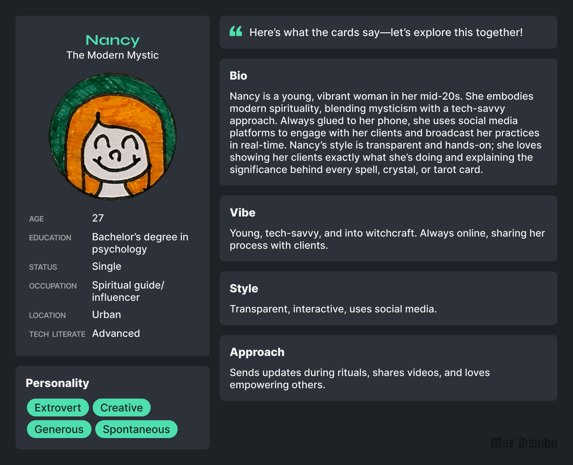
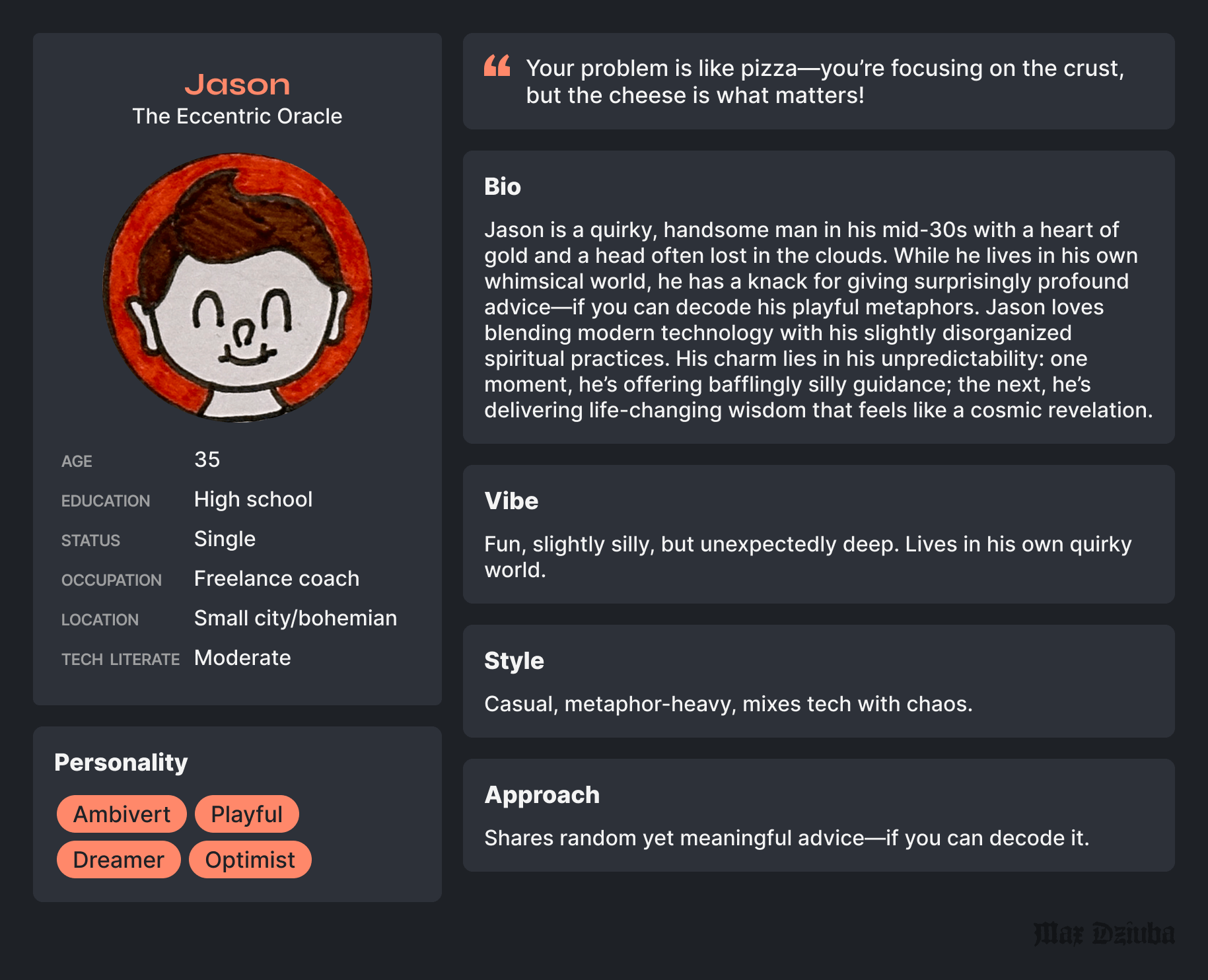
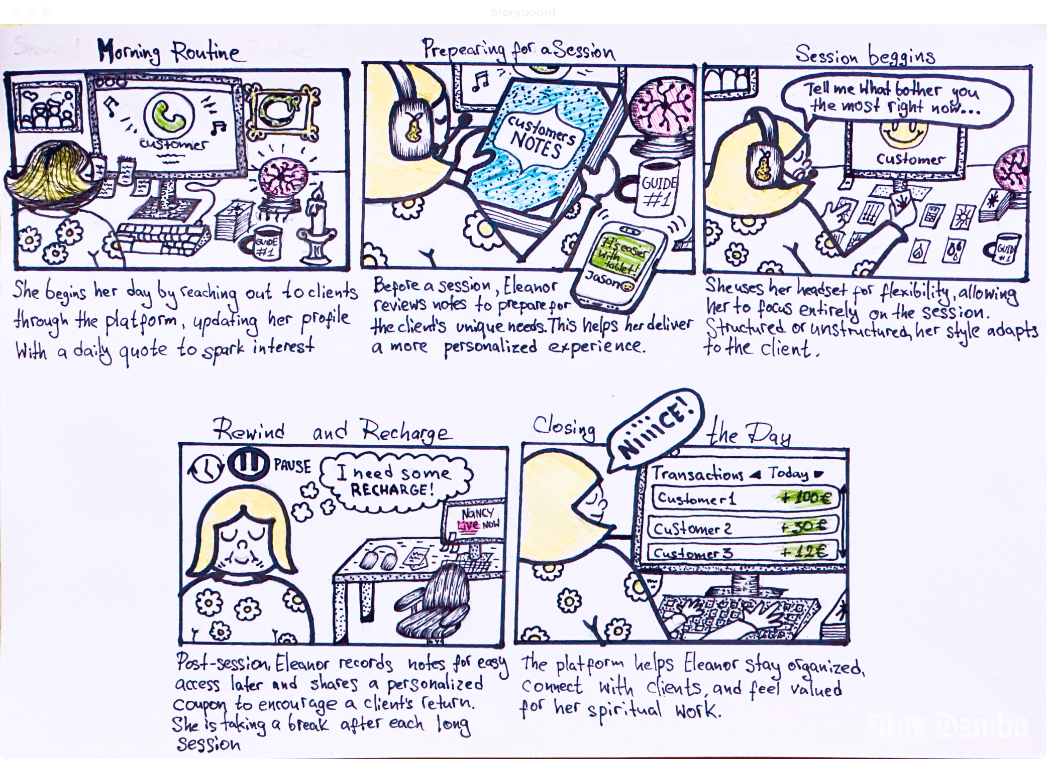
We identified three key personas –Eleanor, Nancy, and Jason – and mapped their unique traits and working styles to align with the platform’s goals and user expectations.
Process
To meet the tight timeline dictated by the Back-end migration, we embraced a pragmatic approach for the MVP:
• Prioritized Back-End Migration: The focus was on transitioning to the new platform as seamlessly as possible.
• Reused Front-End Components: Leveraged existing elements from the new platform to accelerate development.
• Limited Front-End Team Involvement: Kept developers free for post-MVP enhancements.
• Deferred Research to Phase 2: Research and testing were planned for after the MVP launch to refine the experience.
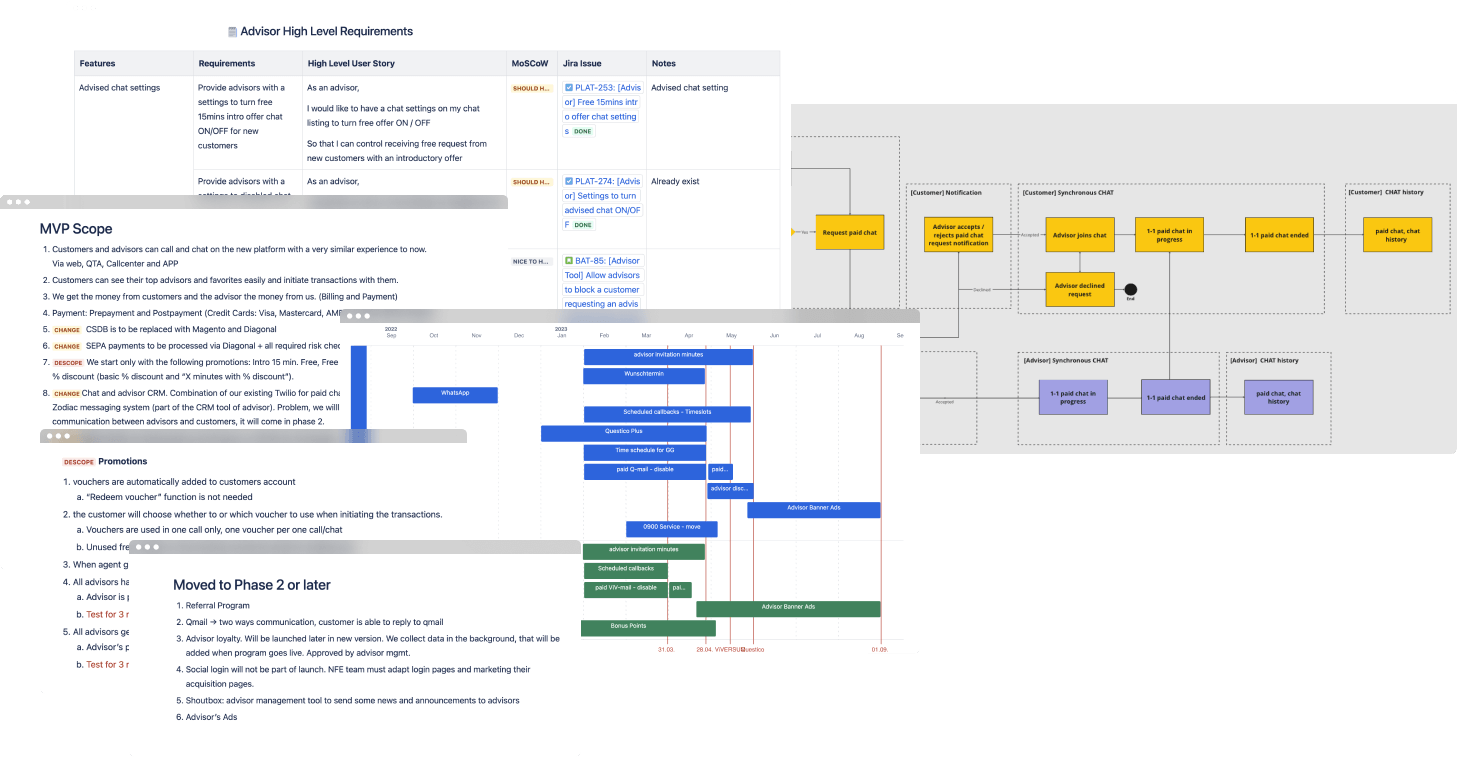
• Scoped Through Gap Analysis: Identified critical functionality and prioritized essential features for launch.
This strategy allowed us to deliver quickly while laying a solid foundation for future iterations.
Partnering with my Lead, Savvinos, I supported PM tasks as we migrated Questico to the Zodiac back-end platform. While Savvinos led ticket management, internal negotiations, and driving ideas, I focused on user flows, prototypes, and leveraging my insights from both platforms to streamline the process.
USA to DACH Market Platform
Zero research is too risky
Skipping research entirely was flagged as a no-go after a gap analysis revealed major risks in omitting key features. To move quickly, the Design Team collaborated with customer support to gather fast, actionable insights.
Seamless integration vs. downscoping 🙃
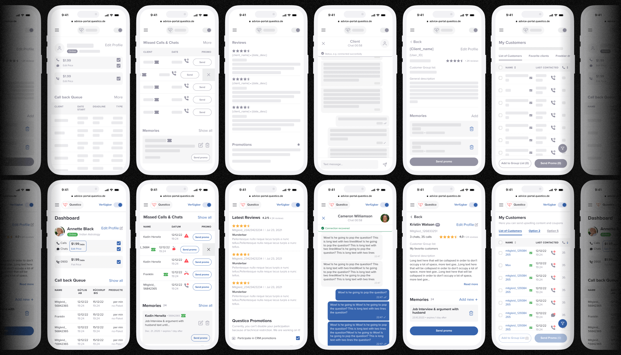
Migrating Questico to the Zodiac platform posed challenges. Zodiac lacked essential advisor tools like customer groups, callback queues, and notes, making it clear that these non-negotiable features had to be integrated for a smooth transition.
Early Designs
Research Objectives
1. Collect User Feedback
Evaluate user satisfaction with the new software post-migration and identify usability challenges.
2. Uncover Pain Points
Explore difficulties faced during the migration and post-launch to guide improvements.
3. Validate New Features
Compare the performance and usability of new functionalities against the previous platform.
4. Set Priorities
Identify and prioritize unresolved bugs and deferred features for future updates.
Research Methods
Our research approach combined qualitative and quantitative methods to capture a holistic view of advisor experiences:

Surveys
We gathered insights from 184 supply-side users to identify key trends and pain points.

Interviews
Spoke with three advisors of varying demographics and popularity to gain diverse insights.

User observations
Visited two advisors to observe daily routines and real-world use of the new design.
Survey Insights
Our research approach combined qualitative and quantitative methods to capture a holistic view of advisor experiences:

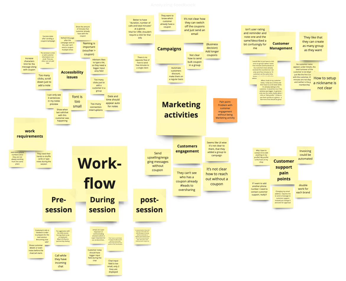
1. Reduced Cognitive Load
Simpler workflows led to a significant reduction in cognitive load, though the steep learning curve remains for long-time users transitioning from decade-old software.
2. Accessibility Barriers
Bugs and limited error recovery disrupted users’ flow, highlighting critical accessibility gaps.
3. Task Challenges
Users struggled with completing tasks smoothly, such as managing customers, promotions, and communication, revealing persistent pain points.
4. Affordance & Navigation
Suboptimal affordance and navigation often caused confusion and reduced intuitiveness.
5. Design Successes
Users praised the clean UI and the new Dashboard for its task overview and status clarity.
6. Process Flexibility
Manual processes requiring Customer Support caused delays and hindered transparency, emphasizing the need for automation.
Quantitative Research Insights
We dug into surveys and user stats, connecting the dots between what users say and what they actually do. This helped us spot trends, validate behaviors, and figure out where the real pain points are hiding.
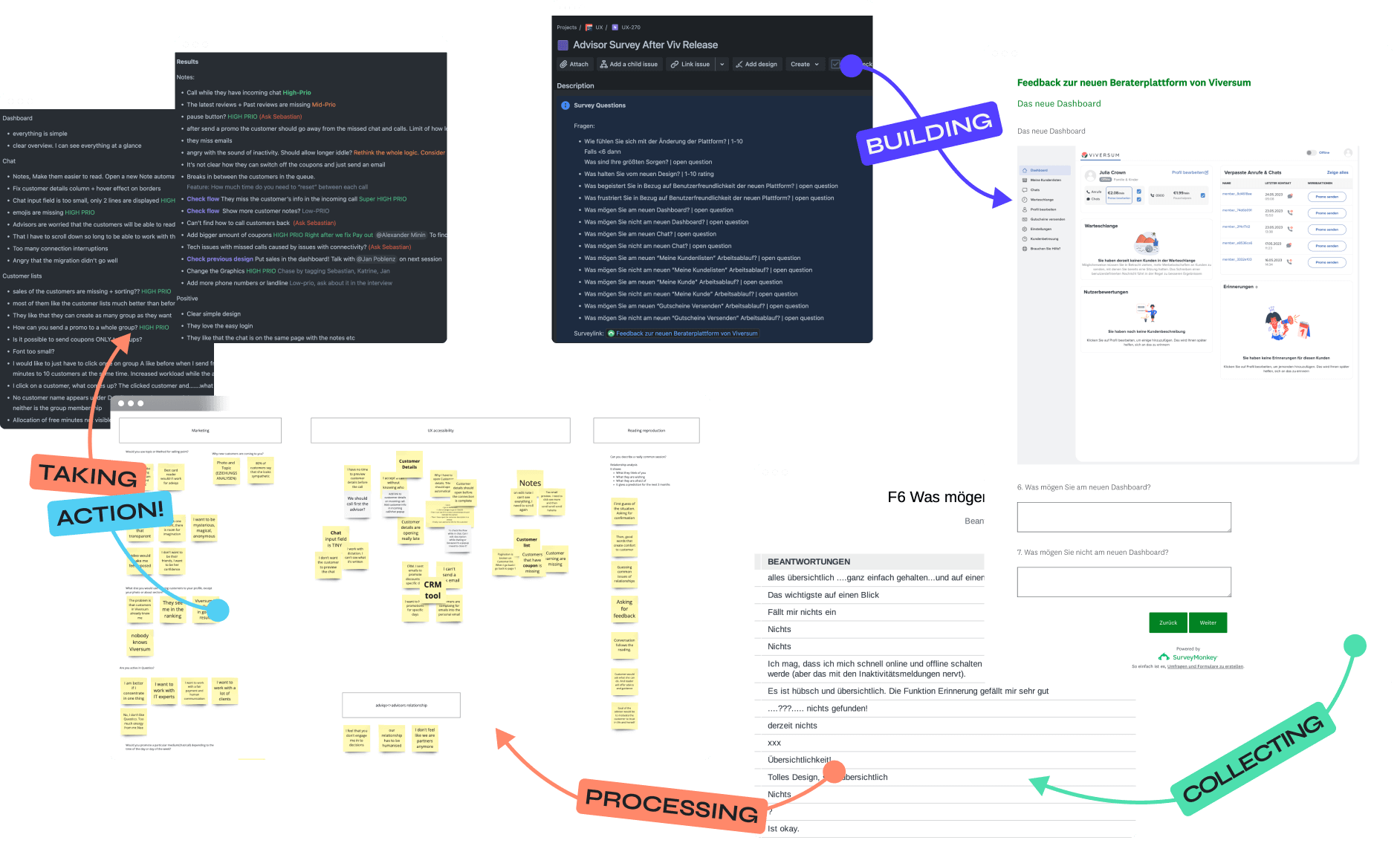
Quick Actions
We tackled the high-priority, low-hanging fruit right away, rolling fixes into the next sprint. This included squashing bugs, addressing UX issues like error prevention and recovery, and automating advisor profile creation and editing – boosting their flexibility and cutting out unnecessary roadblocks.
As a result amount of customer support tickets decreased by 30%.

Dive Deeper
Exploring advisors’ daily routines and marketing needs helped us uncover insights essential for refining workflows and boosting engagement strategies.
1. Daily Routines
To refine key user flows, we needed to understand their rituals better—what a typical session with a customer looks like and how they spend downtime between session.
2. Marketing Activities
Like any freelancer, advisors focus on retention and engagement. We explored their CRM needs and upselling strategies to uncover ways to boost their sales effectively.
Cross Team Workshop
We teamed up with Customer Support and Marketing to compare findings, gathering insights like advisor reach, session stats, and coupon usage. They also shared qualitative nuggets on how a spiritual session works. This collaboration helped refine our focus for user interviews and observation analysis.
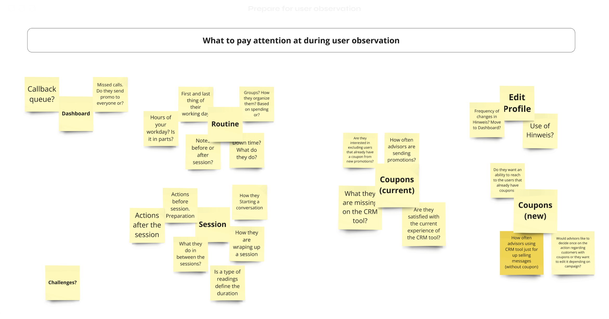
Qualitative Research
We focused on understanding the real-world routines of spiritual advisors through user observation sessions. These sessions offered a behind-the-scenes look into their workflows and everyday challenges. Below, you’ll find snapshots and key insights gathered from these observations, providing a closer look at how advisors interact with the new designs.
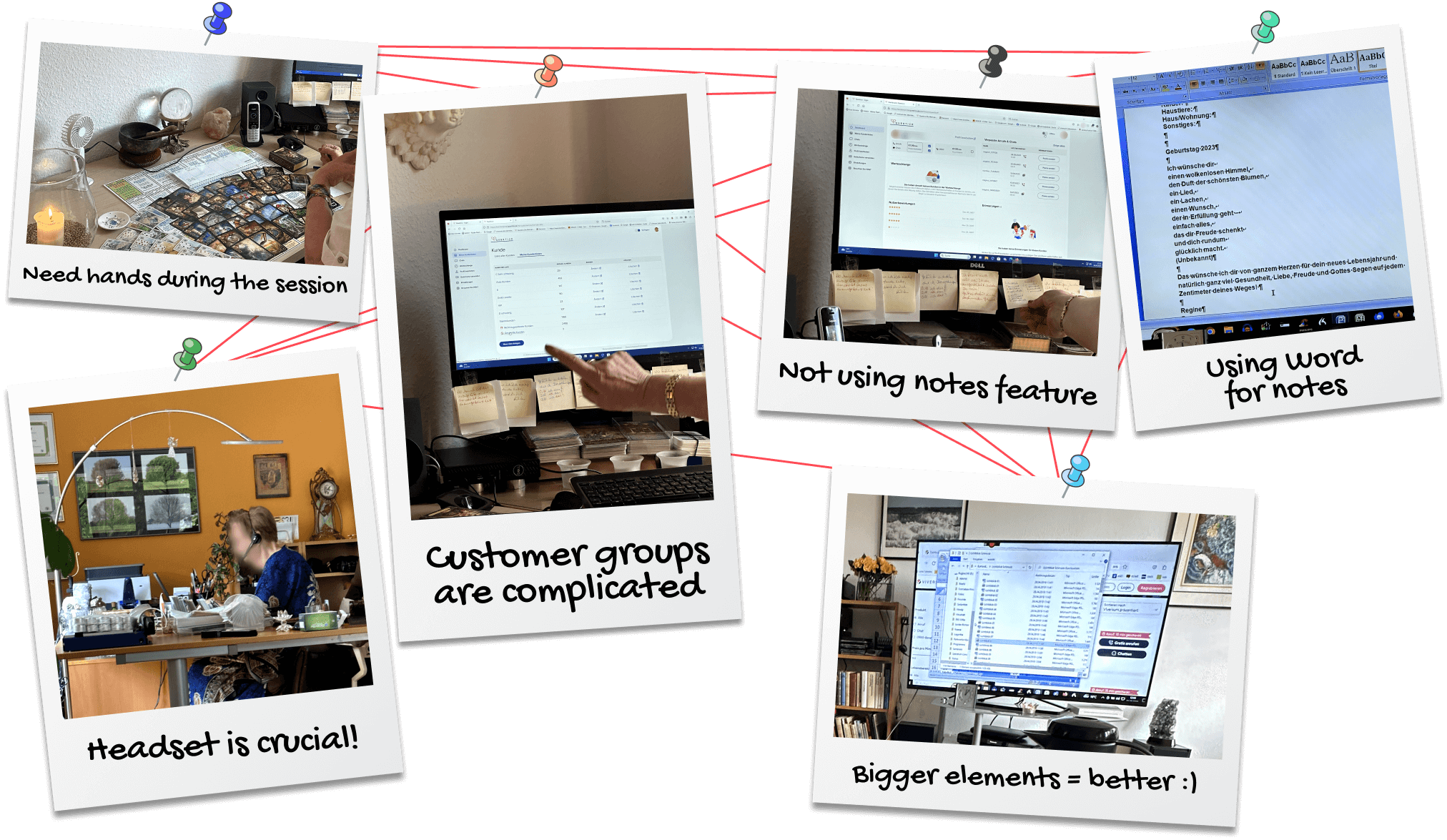
Key Qualitative Research Insights
1. Mapping the User Journey
We identified several friction points along the user journey that disrupted workflow and efficiency.
2. Flexibility Matters
Advisors need adaptable tools. Rigid systems caused frustration and inefficiencies.
3. Feature Gaps and Prioritization
Post-migration, missing or postponed features required immediate focus to meet user needs.
4. Bug Tracking and Resolution
Identifying and resolving critical bugs became a top priority to ensure a seamless and reliable user experience.
Introduced New Product Rituals
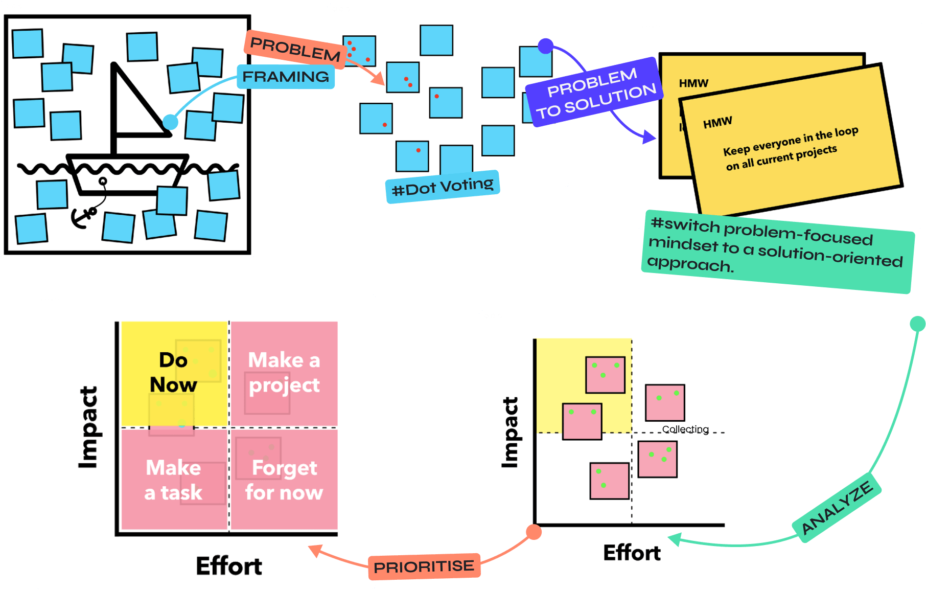
During the MVP phase, many bottlenecks surfaced, and my Lead introduced workshops to address them. I actively contributed by helping test new routines and shaping processes to improve how we:
• Identify and report problems
• Gather and organize insights
• Brainstorm, prioritize, and validate solutions
These rituals evolved into practical habits, fostering smoother collaboration and consistent progress.
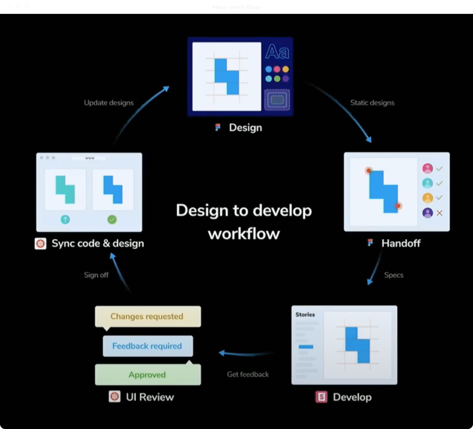
New Product<>Tech Delivery Process
Collaboration isn’t just a "nice to have" – it’s essential. Big projects like this are prime opportunities to refine workflows and strengthen cross-team partnerships for maximum productivity. These insights? Gold for future, steadier times.
Final Designs
Finally, the moment you’ve all scrolled here for (and thank you for making it this far ❤️) – the final designs! After months of research and hard work, I can confidently say this is data-driven design at its finest.
Below you will find interactive prototype, you can navigate through key pages via sidebar menu.
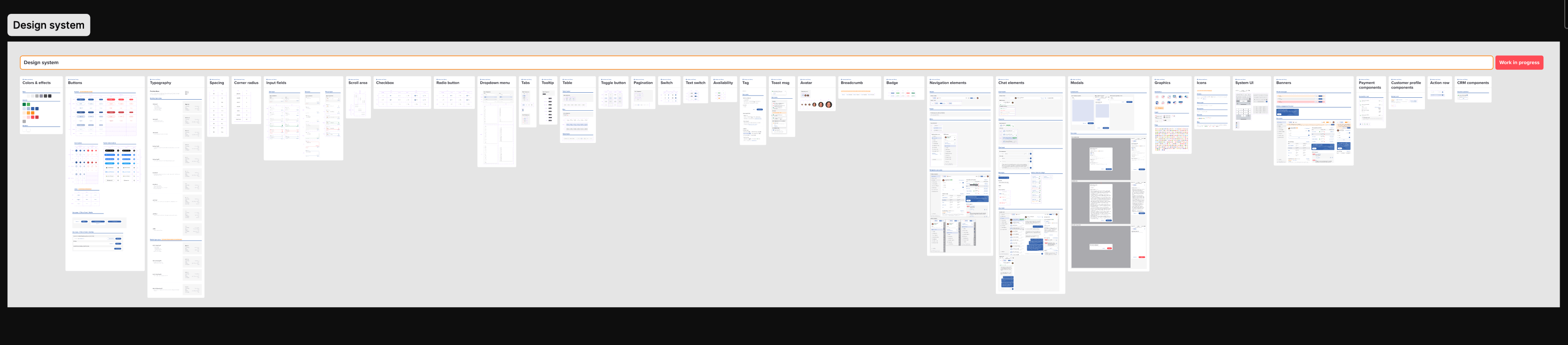
Design system
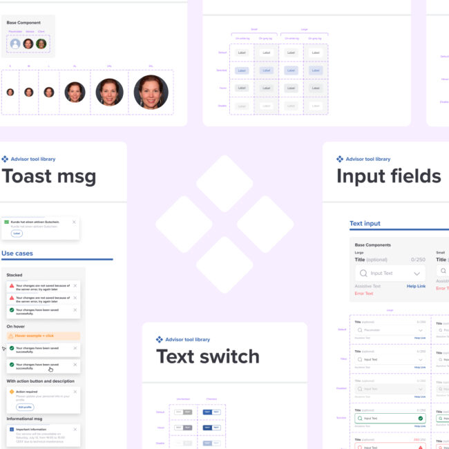
Also for this project I reused and adapted Design System that I've built for the Supply side of the product.
What We Learned
Research is never wasted time
This project reinforced how vital research is. Whether it was observing users in action, gathering feedback, or diving deep into their workflows, every insight shaped our decisions. It’s not just about making informed choices—it’s about making the right ones.
Collaboration builds the foundation
Creating something from scratch isn’t just about design and development. It’s about communication—between product, tech, and support teams. Without their input, the foundation we built could’ve been shaky. Aligning across teams ensured we didn’t just create a visually appealing product but one that was functional and scalable.
Processes are as important as designs
Great designs only come to life when the workflows behind them are just as strong. From introducing new routines to fine-tuning collaboration with tech, we learned that improving processes is just as crucial as improving the product itself.
Take it step by step
A project this massive isn’t solved all at once. By tackling it phase by phase—starting with the MVP—we were able to adapt, iterate, and evolve, making each stage better than the last.
This journey wasn’t just about a platform migration; it was about growth—for the product, the team, and how we work together.
Future
Bug Fixes
Even with thorough testing, a project of this scale is bound to have a few bugs sneak through. Identifying and fixing them post-launch will be a continuous effort.
Post-launch Improvements
Optimization doesn’t stop after release. With user feedback and data-driven insights, we can fine-tune both functionality and design to create an even smoother experience.
Scaling Up
With the foundation in place, the next step is expanding features and improving workflows while sticking to the principles that have guided us so far. This is just the beginning!

Bonus
Because who doesn’t love a little extra? Here’s a sneak peek into the concept we cooked up for advisor statuses.
Never stop exploring! (Just click on “What’s your status?” under the profile pic 😉)