Boosting Conversions with
a Smarter Paywall
Timeline
Nov 2024 — Dec 2024
Platform
App
Role
Senior Product Designer
TL;DR – Redesigning the Paywall for Better Upgrade Rates
Context: The client built a fast-growing time management app for small business owners.
Challenge: The paywall screen caused confusion and low conversion due to unclear value communication.
Role: Led UX audit, design iterations, and UI testing to clarify benefits and improve upgrade flow.
Impact:
• +24% conversion after first paywall redesign
• Made value of premium subscription easy to understand
• Reported 15-20% increase in downloads after ASO screen updates
Why It Matters:
Clear communication of value is critical for conversion. A simple UI shift with user behavior insights can significantly grow revenue – especially for early-stage products scaling fast.
Introduction
A solo developer reached out to me with a request to help improve a key part of his growing product – a time management and booking app for small service-based businesses like nail artists, music teachers, or fitness coaches.
What started as a side project quickly gained traction among local professionals in Ukraine, creating pressure to improve the product fast and make its core value more obvious to new users.
The app enables entrepreneurs to:
• Manage a personal booking calendar
• Share a booking link with clients
• Showcase their work through a media-rich portfolio (photos, videos, audio)
• Send SMS reminders to clients
While the feature set was solid, the conversion to paid subscriptions was low, and the developer reached out to explore how UX and design could help.
💡 Note: the app is available only in Ukrainian. For this case study, I translated the UI into English to ensure clarity and accessibility.
My Role
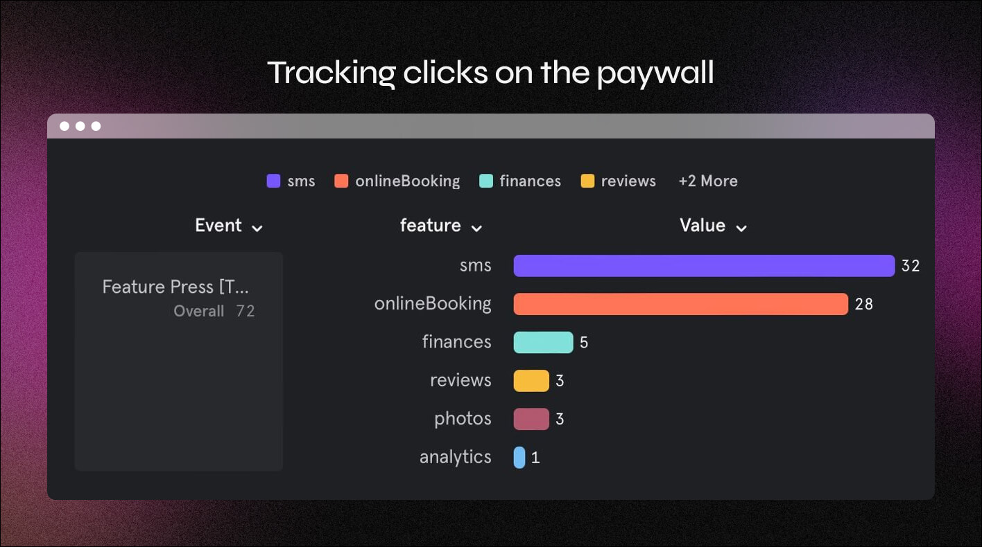
I worked closely with the developer in a 1-on-1 collaboration, handling everything from UX research to interface design. We took a data-informed approach, launching event tracking on the existing paywall to study user behavior. This helped us uncover valuable insights – for example, many users were tapping on individual feature labels, likely expecting more detailed explanations.
Problem
The existing paywall design caused confusion and friction. Users didn’t fully understand what they were paying for – and as a result, many dropped off without exploring the benefits of the paid subscription.
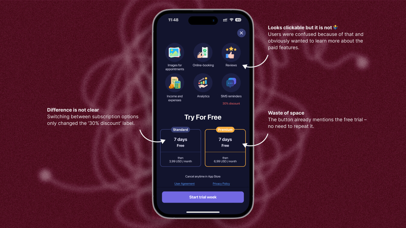
• All features were shown at once with little context or structure
• Switching between “Standard” and “Premium” tabs didn’t clearly highlight the differences
• The main visual focus was on the 7-day trial, not on the actual value of the plans
• It wasn’t clear what was included in the free version and what required a subscription
• Key Premium benefits like the ability to change the SMS sender name weren’t mentioned at all
• Other important features such as more booking slots, media uploads, and SMS discounts were underrepresented or confusing
After we added tracking to UI elements, we noticed that many users were tapping on feature titles – expecting more details or explanations. But nothing happened. This behavior confirmed that users were interested, but the interface wasn’t helping them make a decision.
Defining the problem
Goals
The main objective was to increase subscription conversions by redesigning the paywall screen to better communicate the value of the Premium plan.
From the business side, it was important to make the benefits of the paid subscription more visible and compelling to support growth and monetization.
For users, the goal was to clearly understand what features they would gain from upgrading, what remained available for free, and how each subscription tier matched their needs – without overwhelming or confusing them.
Impact
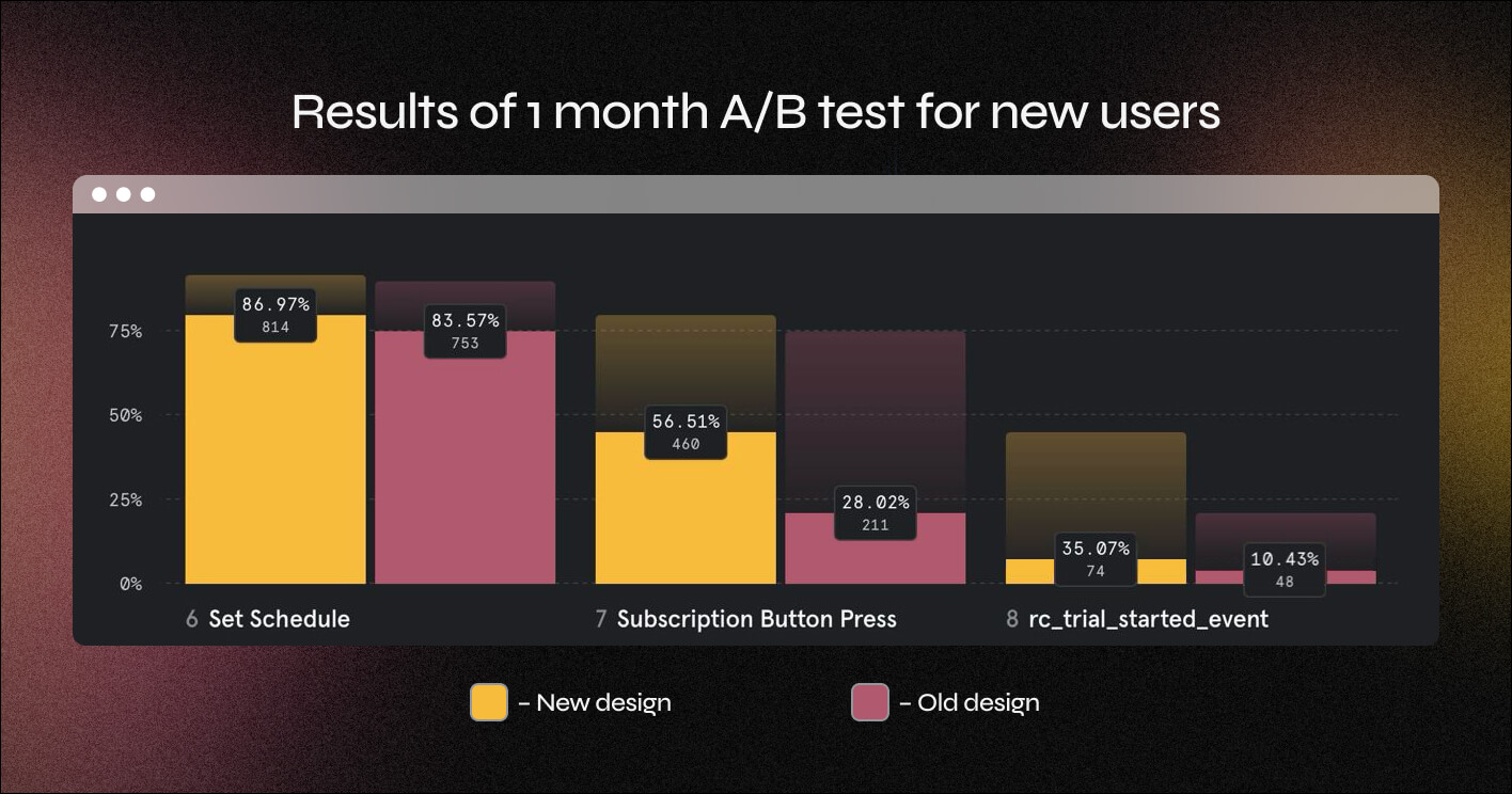
After launching the redesigned paywall, the app saw an increase in subscription conversion of approximately 24%, based on data from the first iteration.
We introduced clearer feature breakdowns, visual comparison between plans, and better emphasis on real benefits – not just the free trial. These changes immediately helped users make more confident upgrade decisions.
Additional impact included:
• Reduced confusion around the subscription model, leading to fewer support requests
• Increased interaction with the paywall screen – users explored details instead of bouncing
• More consistent adoption of Premium-only features like SMS reminders with a custom sender name
Even as a first iteration, the new design delivered results quickly, confirming that clarity and perceived value were the core conversion drivers.
Our Users
Value visual portfolio uploads, more than 3 time slots per day, and personalized SMS reminders to create a professional and trustworthy client experience.
Nail Artists & Beauty Professionals
Value visual portfolio uploads, more than 3 time slots per day, and personalized SMS reminders to create a professional and trustworthy client experience.
Personal fitness or music coaches
Value flexible scheduling, ability to share audio/video samples, and branded SMS reminders for a more polished and organized teaching setup.
Tutors or other one-person services
Value showcasing their work through media uploads, clear booking links, and branding options to present themselves professionally and stand out.
Process
Audit of the Existing Paywall
I started by reviewing the current paywall design to understand what wasn’t working – unclear feature hierarchy, confusing tabs, and a heavy focus on the free trial.
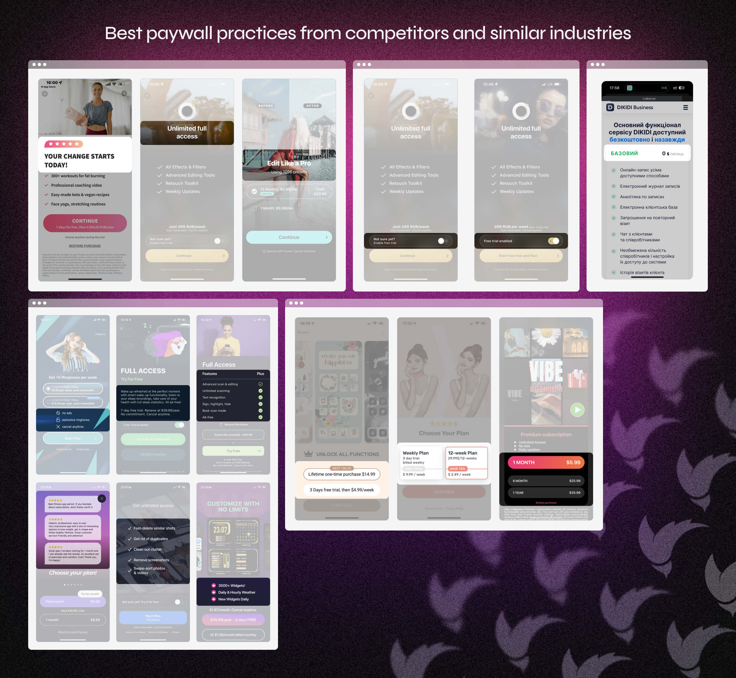
Competitor Analysis
Looked at similar platforms to identify common UX patterns and missed opportunities, especially around how benefits and pricing tiers are communicated.
Identifying Pain Points
Through analytics and behavioral tracking (added click events), we discovered that users were interacting with UI elements to understand feature details – which clearly weren’t explained well.
• Users didn’t understand what they were paying for
• No clear difference between Standard and Premium plans
• Important perks like custom SMS sender name were hidden
• Switching plans didn’t visibly change feature lists
• Users clicked on features seeking more info – and found none
Creating a Clearer Hierarchy
Restructured how features were grouped and displayed, making it easier to see what comes with the free version vs. the paid plans.
Designing a Feature Comparison Block
Built a simple, easy-to-scan comparison section that made the differences between “Standard” and “Premium” obvious – including previously hidden benefits like custom SMS sender names.
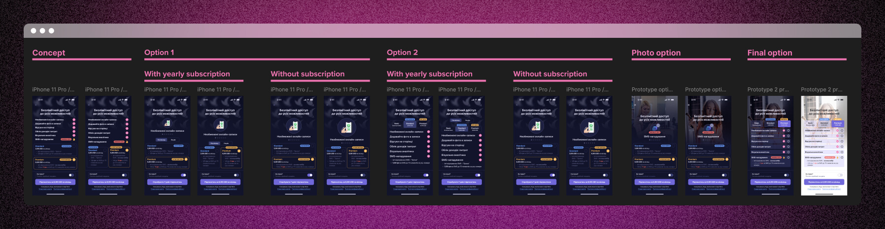
Testing Visual Layouts
Explored multiple layout and UI directions, quickly iterating with the developer to find a solution that felt balanced, clear, and matched the tone of the rest of the product.
Rapid Collaboration
Worked closely with the developer to launch fast – this allowed us to implement, test, and measure improvements almost in real-time.
Final Designs
The final version of the paywall focused on clarity, simplicity, and transparency. It aimed to reduce cognitive load, clearly explain the value of upgrading, and maintain a friendly, approachable tone in line with the app’s audience. The layout was built to be responsive, with translated visuals for this case study to improve accessibility.
The new design included:
• A side-by-side comparison of free vs premium features
• Highlighted benefits with icons and short, benefit-driven descriptions
• A clear CTA to encourage upgrade
• Subtle, friendly design to match the app’s tone and audience
Learnings
This project was a great example of how even a small design change, when grounded in real user behavior, can drive measurable business impact. Working closely with the developer allowed me to move fast and stay focused on real data rather than assumptions.
• Small UX problems can hide big conversion blockers
• Clear hierarchy and visual structure are essential when communicating pricing and value
• Testing early ideas through user behavior data (click tracking, scroll depth, etc.) can guide better design decisions
• Collaborative and flexible communication with a developer can speed up iteration and implementation
Future
The redesigned paywall made a strong impact, but as the product evolves, there’s still space to optimize based on user behavior and business needs. The next steps could focus on refining messaging and introducing more dynamic, personalized elements to the screen.
Potential directions:
• Add testimonials or quick ROI examples for premium
• Consider A/B testing shorter vs longer descriptions
• Highlight most-used features based on user behavior (dynamic paywall?)
Bonus: ASO
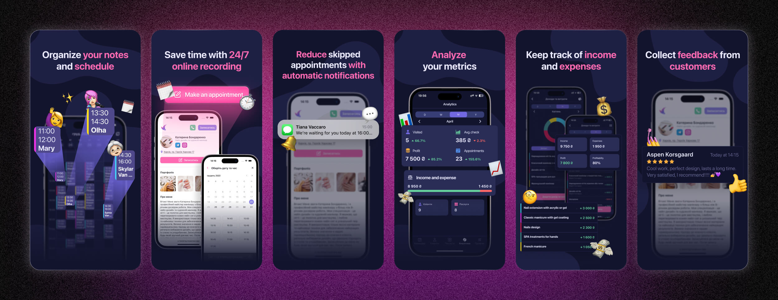
Alongside the paywall redesign, I also updated visuals for the app’s store presence (ASO). The goal was to better reflect the product’s core value for small business owners and increase first impressions and installs.
While exact analytics weren’t tracked in detail, the developer observed an estimated 15-20% boost in downloads shortly after the new visuals went live.