Building & managing
design system
Timeline
March 2024 — Oct 2024
Platform
Web
Role
Senior Product Designer
TL;DR – Scaling Design for a Chat-Based Marketplace
Context: A fast-scaling digital marketplace connecting spiritual advisors with clients via chat-based sessions was suffering from inconsistent UI, slow design velocity, and handoff issues across platforms.
Challenge: Fragmented components, unclear visual language, and a lack of documentation made it hard to scale across multiple products (mobile, desktop, internal tools) and user roles (clients & advisors).
Role: As Senior Product Designer, I led the creation and rollout of a unified cross-platform design system, aligning product, engineering, and brand teams to create consistent, reusable foundations.
Impact:
• Created a scalable, token-based design system adopted across 2 platforms (client side (2 brands), advisor side).
• Reduced new feature UI design time by ∼40% through reusable components and clear documentation.
• Improved dev handoff speed and quality by introducing shared naming conventions, Figma libraries, and usage guidelines.
• Enabled consistency across key journeys (onboarding, chat, transactions) without slowing down iterative product work.
Why It Matters:
This wasn’t just a visual polish — the system became a scalable backbone for product development, enabling the team to move faster while delivering a smoother, more trustworthy experience for both clients and advisors.
Introduction
Building a design system from scratch is much easier than fitting it into an already living organism. It's more than just creating components – it’s about structure, consistency, and collaboration. As a Product Designer, I took on the challenge of designing the system and aligning it with developers, improving workflows, and ensuring its long-term usability.
This case study explores how we successfully built a scalable design system for a chat-based platform that connects spiritual advisors with seekers at Adviqo GmbH.
Adviqo GmbH has been acquired by Ingenio, US-based category leader on May 2022.
My Role
As a Product Designer, I worked closely with my Team Lead, Savvinos, and Front-End Chapter Lead, Maksim, ensuring seamless collaboration between design and development. I led the creation of the Design System based on drafts provided by Savvinos, structured high-fidelity Figma components, and established clear documentation for both designers and developers, also enhancing some components with annotations in a Dev mode.
Problem
The Advisor Tools side of the platform lacked consistency, leading to inefficiencies in both design and development. UI components were scattered, naming conventions were inconsistent, and collaboration between designers and developers was challenging. As we migrated to a new tech stack, we saw the opportunity to solve these issues by introducing a structured, scalable design system. We started building it in close cooperation with devs team to make sure that, in the end, what we have in Figma matches with what we have in Storybook.
PROBLEM #1
Draft components
Since most of the components were made in a hurry for the MVP (as it usually happens 🥲) we couldn’t reuse them as product started to grow. Therefore we were in need to tune up almost every component that we had, from input fields to modal frames.
Example
• No structured button sizes and possible action states
• Validation for the input field isn’t part of the component
• Sizes for the graphic elements, avatars and illustrations were not defined
Impact
Design team couldn’t reuse components while creating new flows with common elements across the design.
PROBLEM #2
No documentation and guidelines
Lack of rules for basic design principles led us to different font sizes, corner radius of the elements, etc from page to page. Which is crucial not only for the design team but also for our fron-end fellows.
Example
• Corner radius for parent and nested elements were different depends on who designed the page.
• Typography rules are abstract and unmeasurable for desktop and mobile view.
• Icon has different sizes and styles which led to problems while scaling.
Impact
Designer spending a lot of time visually finding out common rules for each element instead actually working on the design.
PROBLEM #3
Unconsistancy between design and production
All the challenges and inconsistencies mentioned above resulted in the absence of a single source of truth. We realized that what we have in Figma is not always matches with elements in Storybook.
Example
• Style and functionality of input fields, buttons, checkboxes etc. differs from flow to flow on the production.
• Some action states are missing on the production because they are not defined in the design.
• We have behaviour of some elements on the production that we never had on the design file.
Impact
Without a structured design system, each team played its own “genre of music,” making us sound like an uncoordinated school orchestra 😅
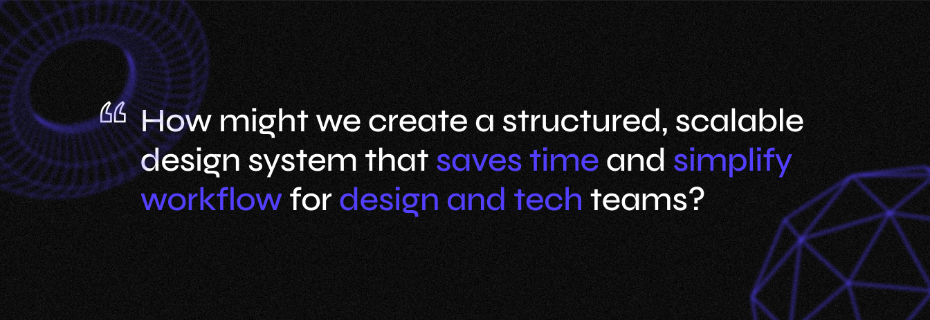
Defining the problem
Goals
BUSINESS GOALS
Increase Efficiency
A structured design system speeds up both design and development, reducing time spent on repetitive tasks.
Ensure Scalability
A unified system allows for easier expansion, whether adding new features or adapting to multiple brands.
Cut Costs
Streamlined workflows mean fewer design inconsistencies, less back-and-forth between teams, and ultimately, lower development expenses.
USER GOALS
Consistent Experience
A unified design system ensures a familiar and seamless experience across the platform.
Improved Usability
Clear, structured UI elements make navigation more intuitive, reducing friction in both advisor and customer journeys.
Faster updates and improvements
With a scalable design system, new features and enhancements can be rolled out more efficiently, improving the platform over time.
Impact
The implementation of the design system significantly streamlined our workflow and improved overall efficiency. By introducing structured documentation and standardizing components, we minimized friction between design and development, ensuring a smoother handoff process. This not only reduced misunderstandings but also sped up implementation by eliminating redundant work and providing a single source of truth for both teams. Additionally, the design system laid a strong foundation for scalability, allowing us to extend it seamlessly to the Customer side while maintaining consistency across multiple brands.
Our Users
A design system is more than just a UI kit – it’s a shared language for everyone involved, from designers and developers to stakeholders. Our goal is to create a single source of truth that stays consistent, up-to-date, and seamlessly integrated across Figma, Storybook, and production.
But all of us has our own needs which needs to be covered:
Developers
Required a structured, reusable component system to speed up implementation and reduce inconsistencies.
Stakeholders
Benefited from a shared source of truth, reducing back-and-forth discussions on design decisions.
Designers
Need a clear, structured component system that is intuitive, easy to use, and self-explanatory.
Process
To meet the tight timeline dictated by the Back-end migration, we embraced a pragmatic approach for the MVP:
• Laying the Foundation – I built on the initial drafts my Team Lead had created, refining existing components (like buttons) and establishing logical rules for spacing, typography, and naming.
• Component System & Variables – I designed every new component from scratch, ensuring maximum reusability through variables and structured components.
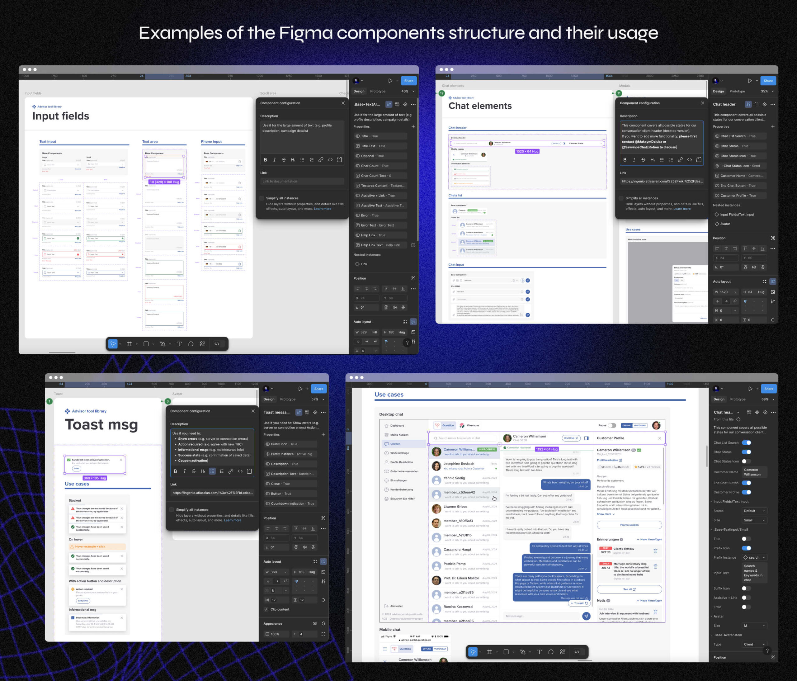
• Alignment with Development – Frequent meetings with our Front-End Chapter Lead ensured naming and structures matched across Figma and Storybook. We also aligned with developers to add annotations for ambiguous elements and behaviors, which proved to be more effective than traditional documentation in our case.
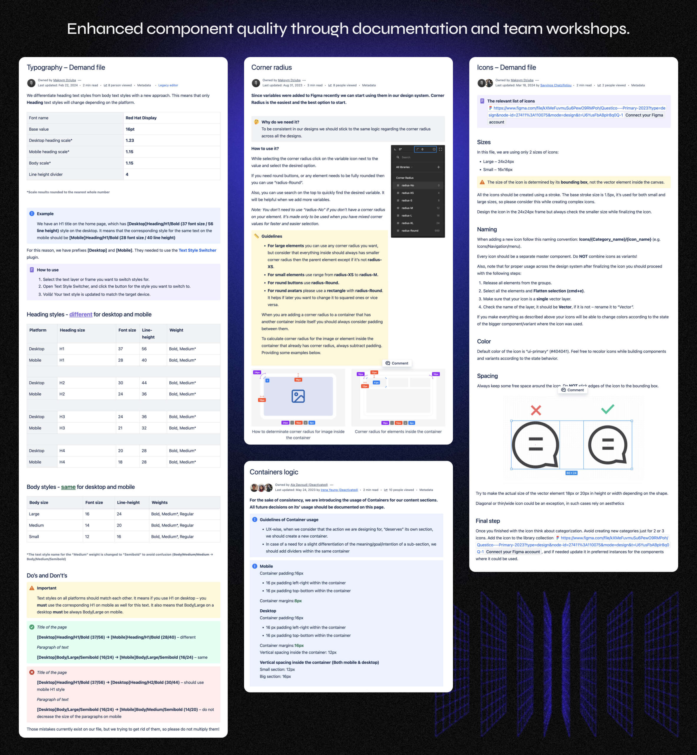
• Documentation & Education – I documented every element’s usage guidelines, do’s/don’ts, and best practices. This was followed by a team workshop to ensure adoption.
• Expansion to Customer Side – Unlike Advisor Tools, the Customer side had an established brand identity. We implemented updates gradually, integrating new components while maintaining brand consistency.
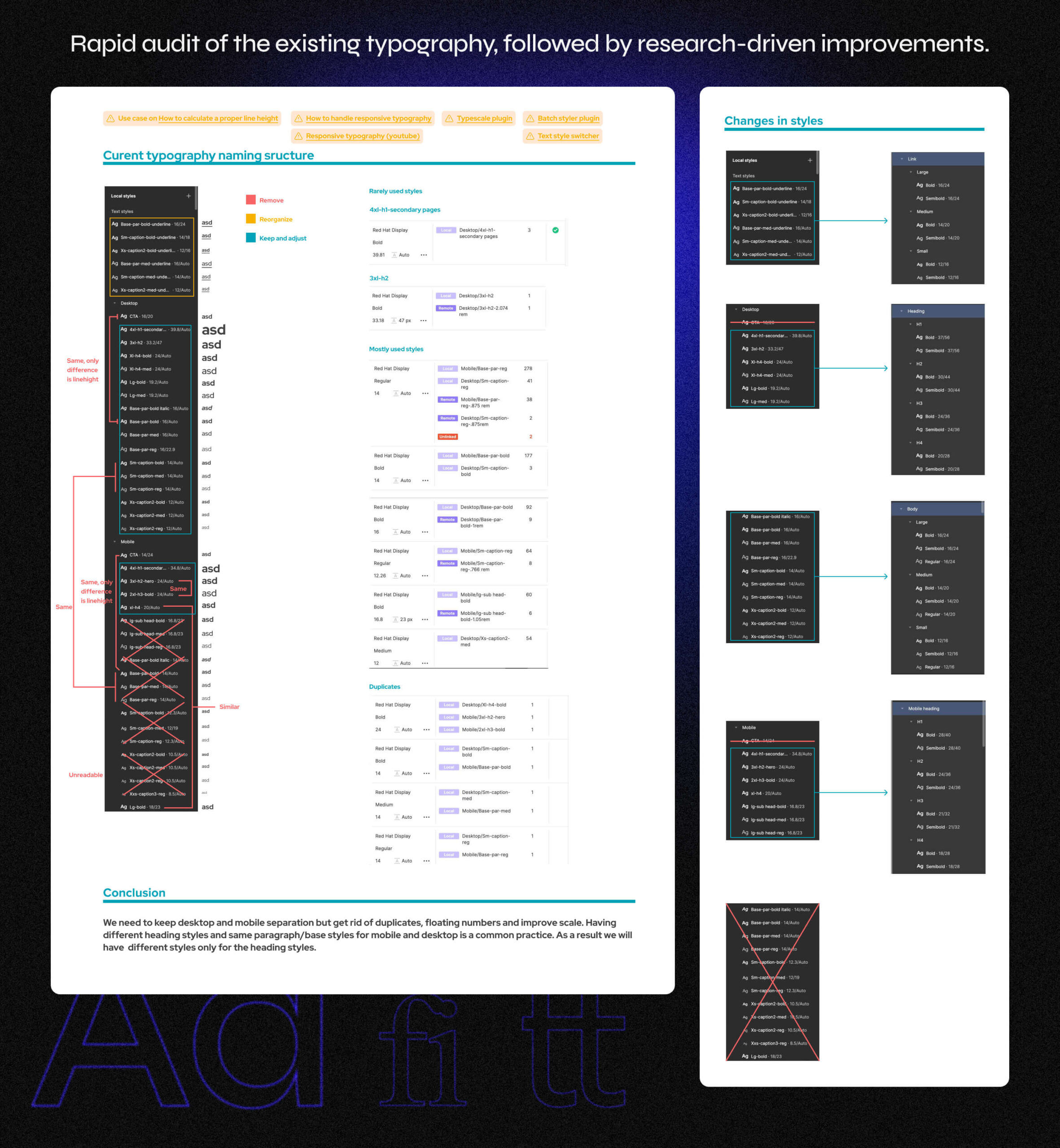
I also reworked the typography scales for the Customer side, as they were chaotic for both developers and designers. Without documentation from the previous team, no one could clearly explain the logic behind the existing system.
• Ongoing Evolution – We set up a workflow for continuous updates, keeping the system adaptable as the platform evolves. This also reduced QA workload by standardizing design and front-end components.
The Three Pillars of a Strong Design System
A truly effective design system stands on three essential foundations: Components, Variables, and Documentation—ensuring consistency, flexibility, and clarity across design and development.

Components
The building blocks of the interface, crafted for reusability and efficiency.

Variables
The glue that holds the system together, bringing consistency to spacing, colors, and typography.

Documentation
The guide that keeps everyone aligned, making adoption seamless across teams.
Bridging Design & Code
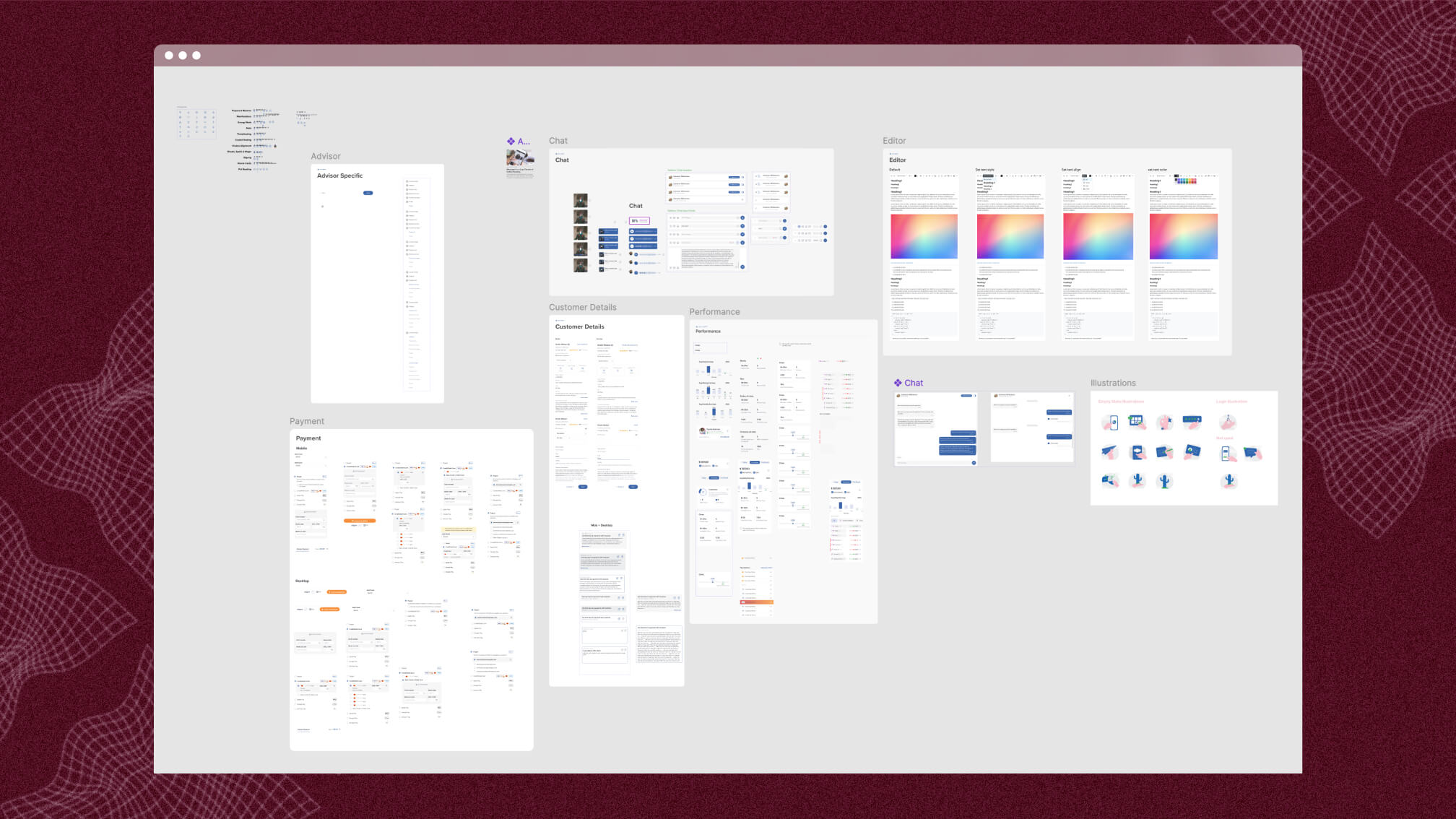
We built the design system from the ground up, starting with core elements like typography, spacing, and colors, then structured scalable components with semantic naming and variables. Once refined in Figma, we aligned everything with Storybook to ensure seamless integration between design and code.

Final Designs
The result was a robust design system for the Supply side, built for scalability and efficiency. Collaborating with my Lead, Savvino, and Frontend Lead, Maksim, we integrated Chromatic into our workflow, streamlining visual testing and ensuring consistency across design and code. After a successful implementation, we extended the approach to the Customer side, carefully adapting it to an existing brand identity – unlike the Supply side, which had minimal visual constraints. This iterative, systematic approach set a strong foundation for future enhancements across the entire platform.
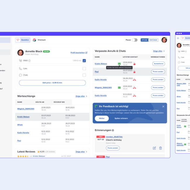
Supply side
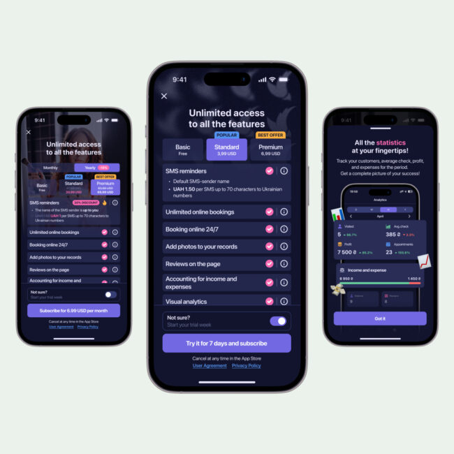
Demand side
What We Learned
Embracing New Tools & Limitations
This project coincided with the launch of Figma Variables, and while we implemented them for spacing and corner radius, time and budget constraints prevented us from optimizing the color system. Still, a design system is a living organism, and future improvements are already on the roadmap.
Bridging Design & Development
Implementing Chromatic and working closely with the Front-End team was a deep dive into alignment, negotiation, and problem-solving. From bug fixes to logic discussions, this collaboration strengthened our ability to find compromises and build a shared vision.
Mastering Storybook & Dev Workflows
Getting hands-on with Storybook and understanding front-end workflows made it clear that every product designer should grasp the development side. This knowledge not only streamlined the handoff but also improved the way we design for scalability.
Falling Deeper for Design Systems
This experience reinforced one thing: building and evolving design systems isn’t just about consistency—it’s about efficiency, collaboration, and making better products.
In a conclusion I would say that this case made my love to design systems even stronger!
Future
Building a White-Label Design System
With multiple brands under our company, we agreed to evolve our system into a scalable white-label solution. I even prepared an internal presentation showcasing the concept. You can find a small part from the presentation below:
Expanding Developer Documentation
Developers will soon document common workflows and best practices for using the design system from their perspective, ensuring a smoother implementation process.
Bi-Weekly Design System Syncs
To keep the system evolving, we established bi-weekly meetings where the team can contribute, fix, and propose extensions to the library, making it a true collective effort.
Going Public
Once the white-label system is in place, we plan to make it public – accompanied by unified documentation co-written with developers, opening up our work for broader impact.

Bonus: My Most Complex Figma Component 😅
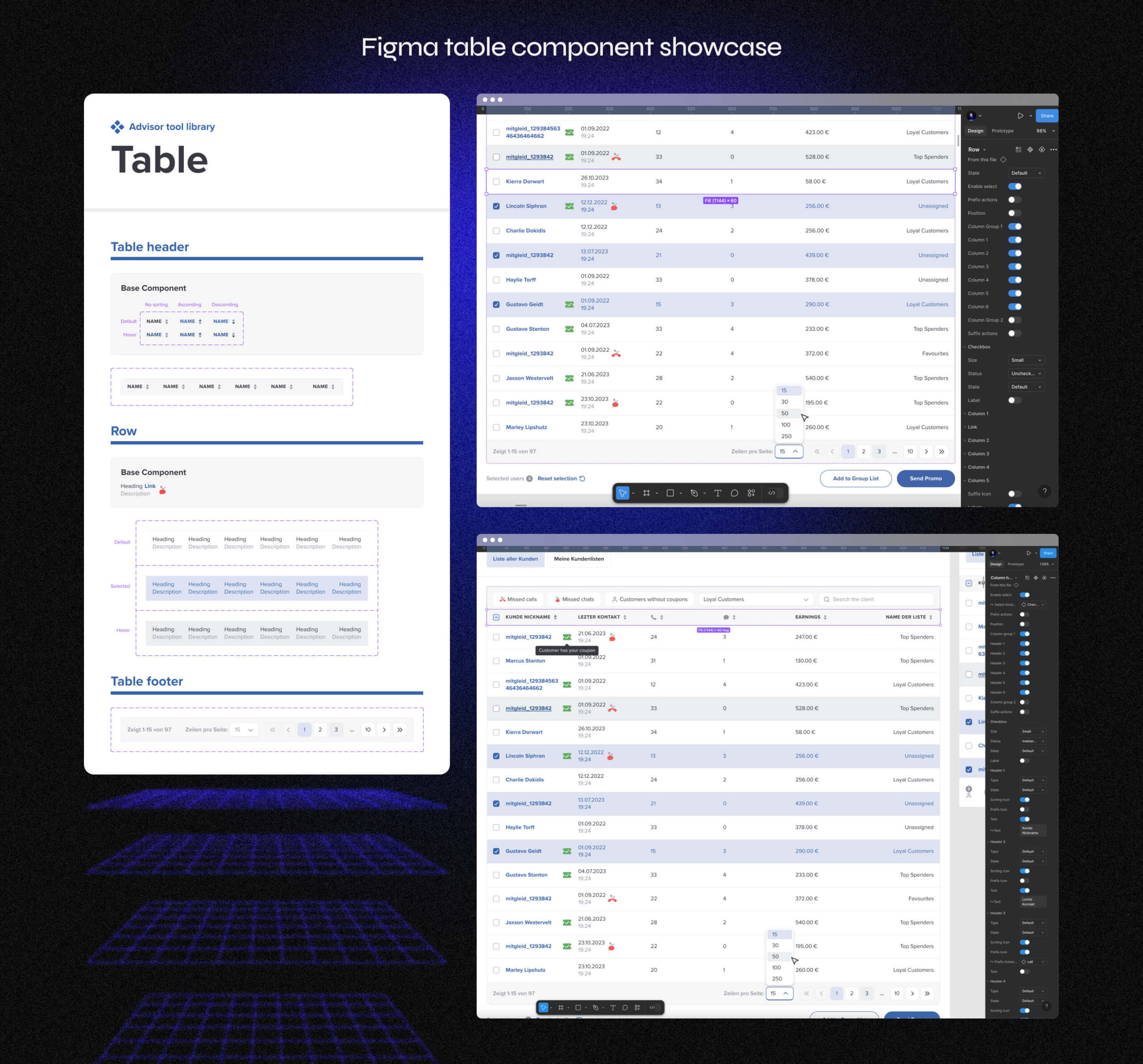
One of the most challenging yet rewarding components I built was the table row and table header set. Since tables are a core element across the entire Supply side, creating a flexible, scalable solution was a top priority. It required extensive collaboration with developers – countless discussions, iterations, and refinements – but in the end, we nailed it. The final component worked seamlessly for both design and front-end teams, making workflows smoother and more efficient.
Here are some screenshots showcasing the result.